Welcome to tianlan’s Blog
-
Positions through contextualising
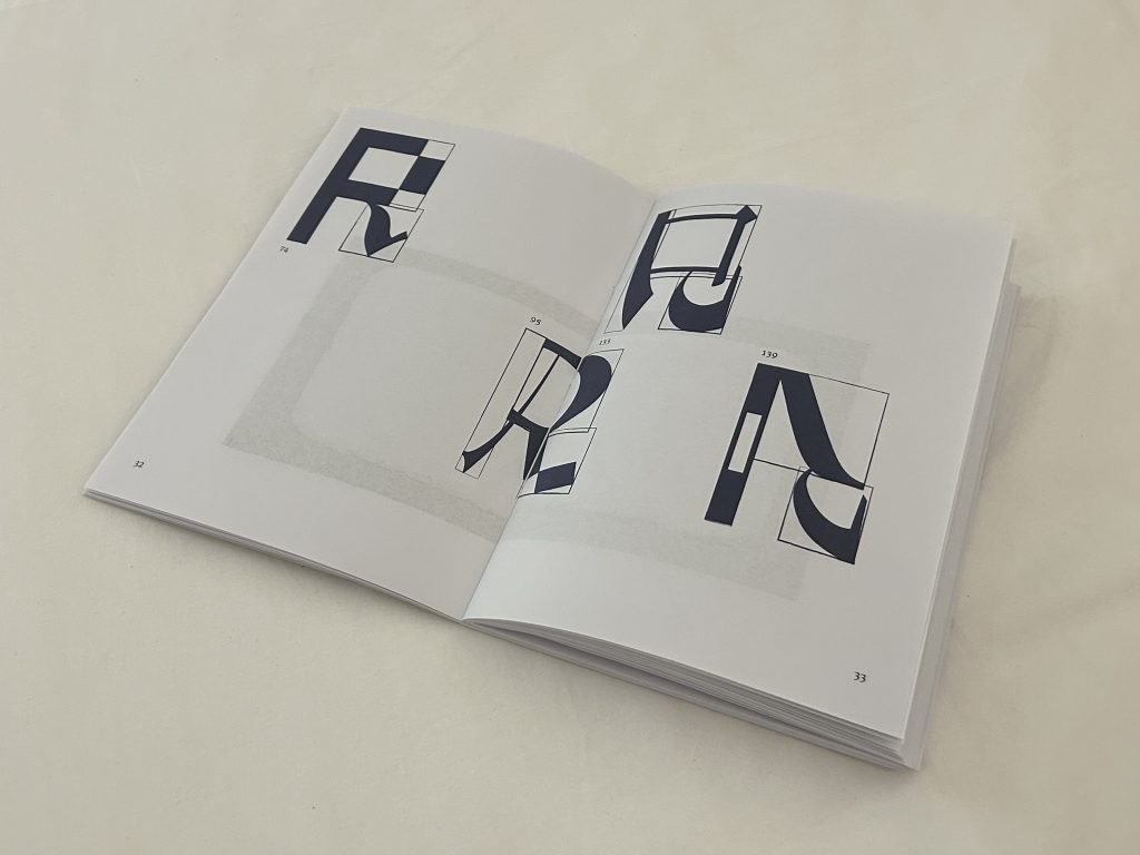
Publication
Poster
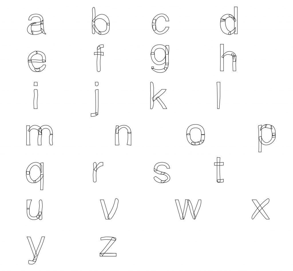
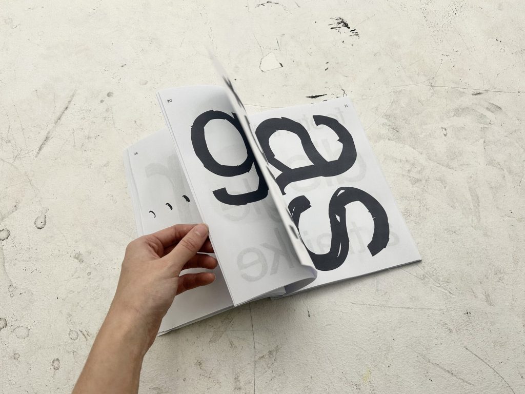
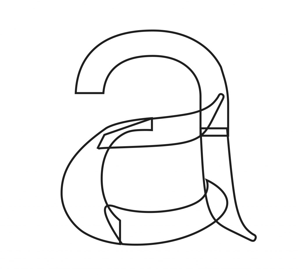
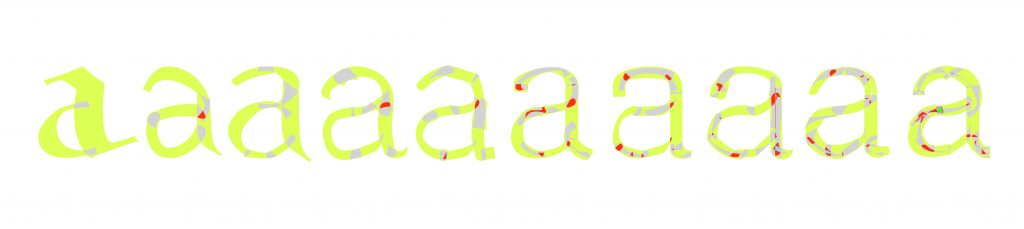
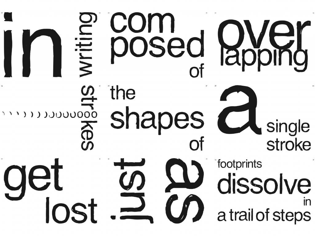
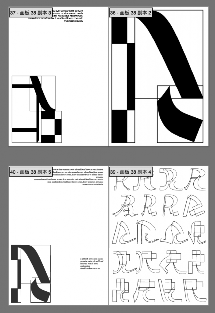
letter making experiment1-replicating helvetica by combining strokes from other typefaces 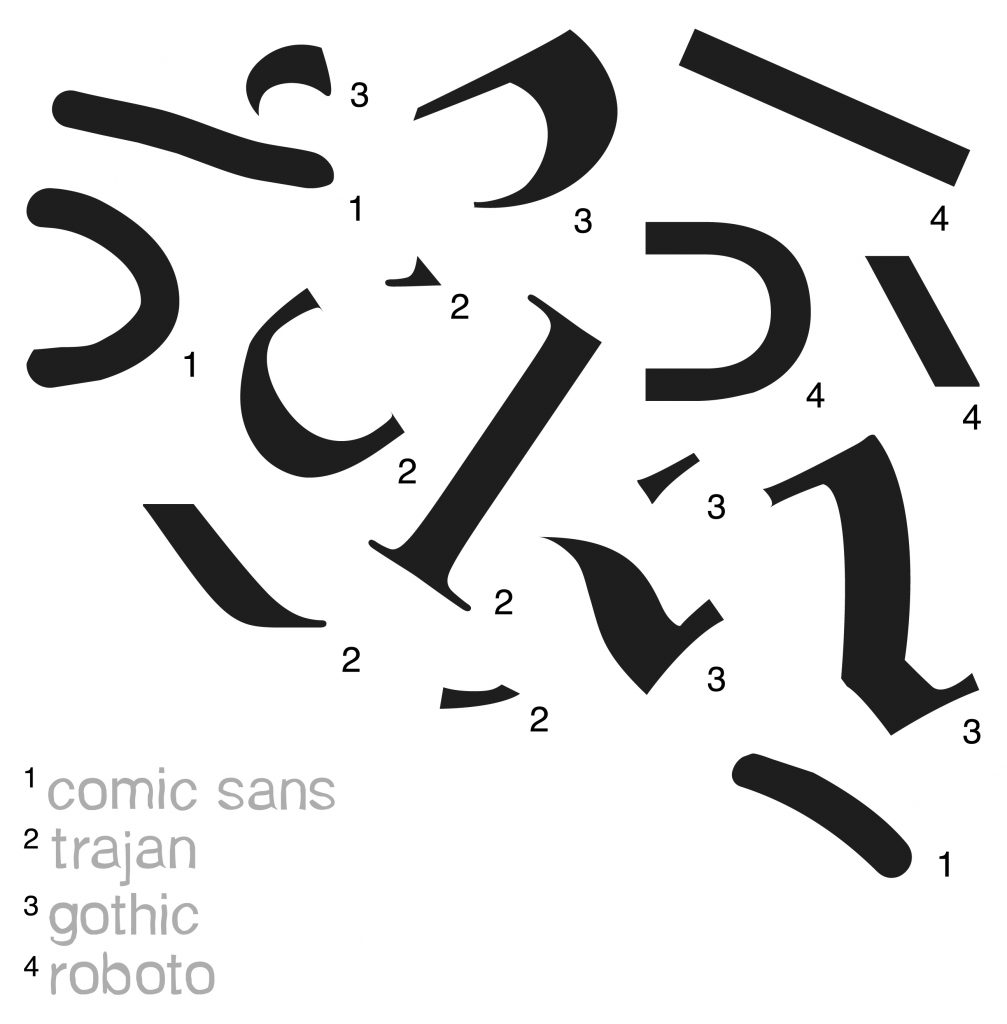
strokes come from 4 typefaces 
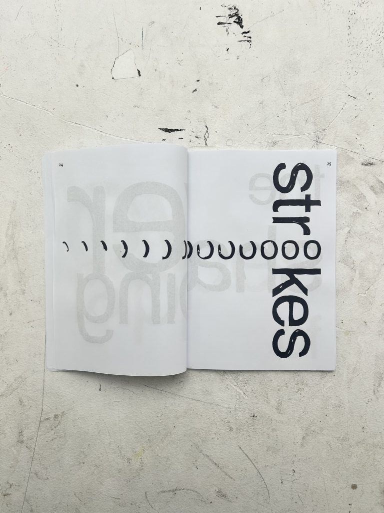
comparative analysis-the stroke amounts wold effect the looking mode among whole and parts 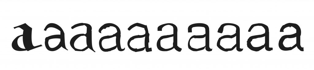
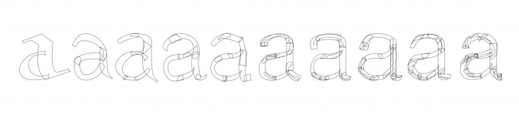
experiment 2-increasing stroke amount 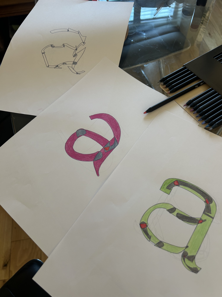
using colour to highlight overlapping area 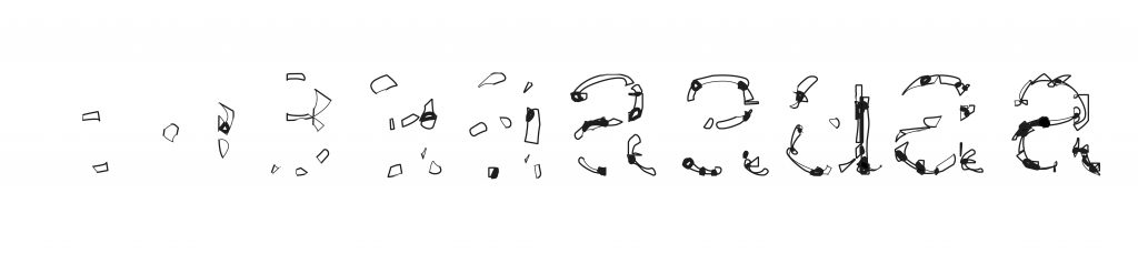
using stroke weight to highlight overlapping area 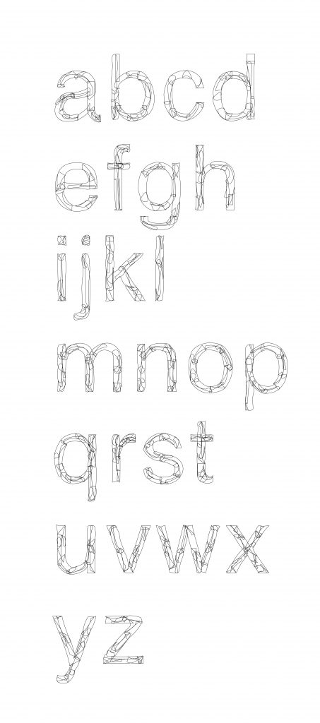
letter making experiment 4-each stroke contains more than 10 substrokes 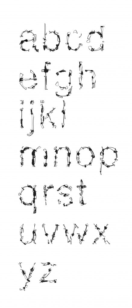
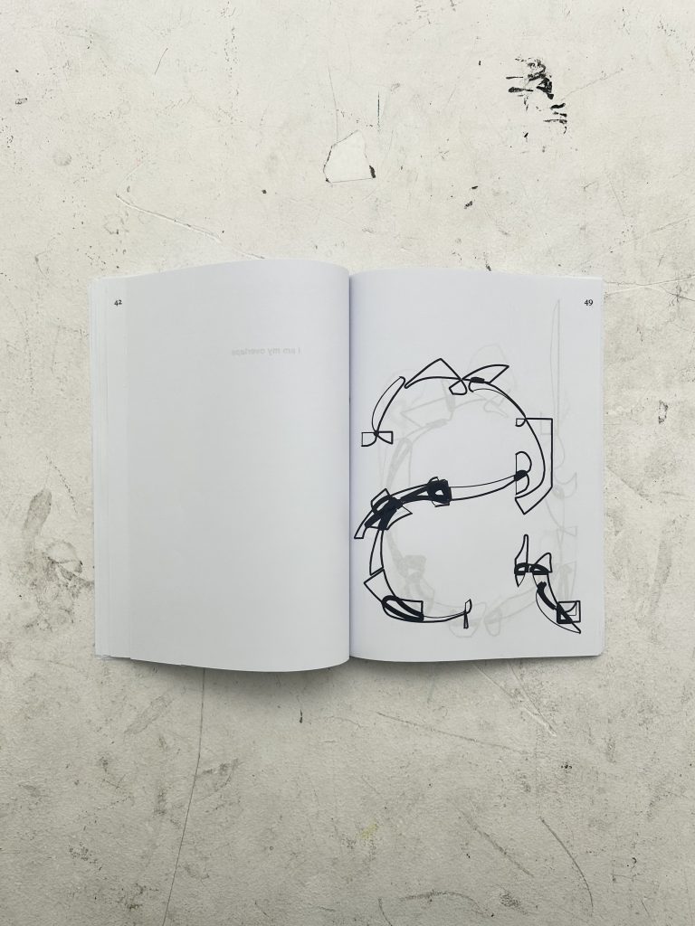
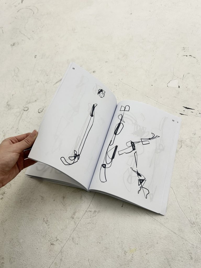
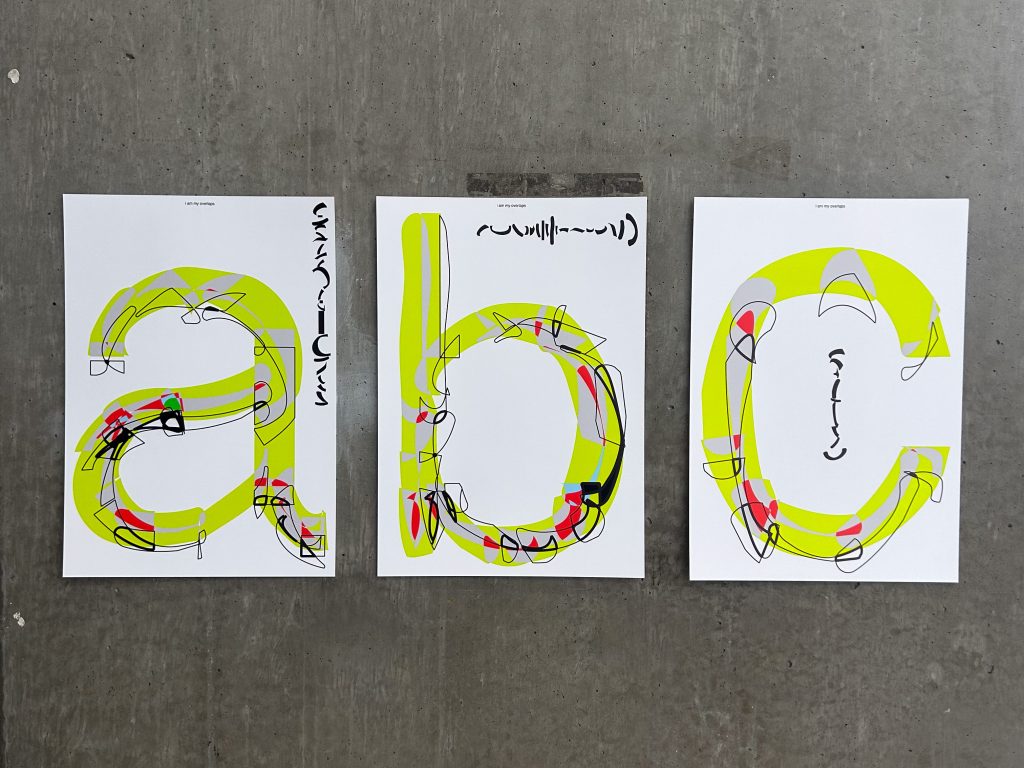
type face made by their own overlaps 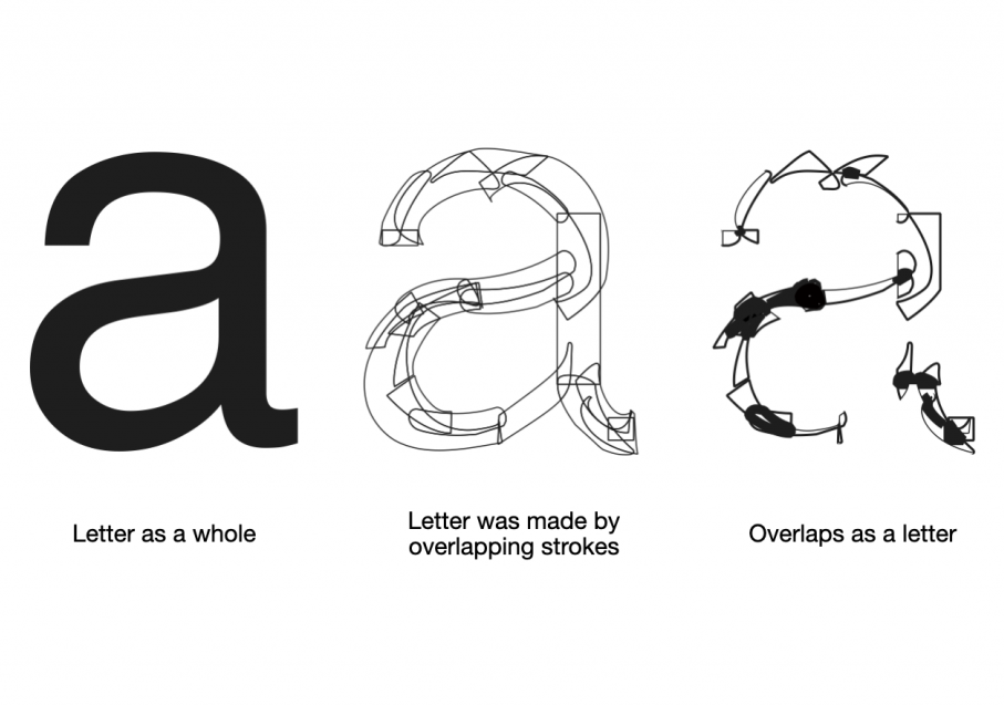
three stages of my evolving understanding of letter making during the project 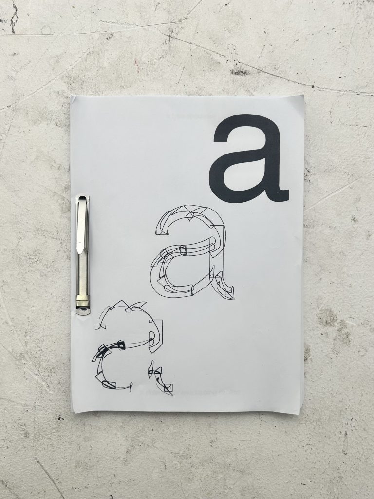
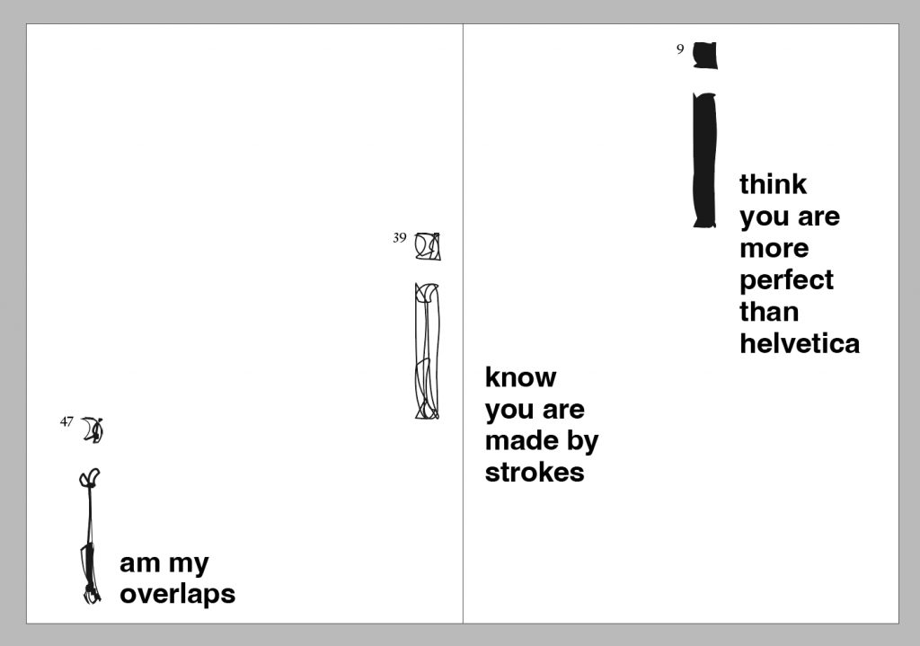
publication design-A type specimen & Explore the discourse of type making and overlapping strokes 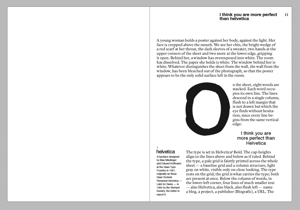
chapter 1 i think you are more perfect than Helvetica-An exploration of the typographic ideology of ‘seamlessness’ and ‘absolute perfection’ for which Helvetica is held up as the gold standard. 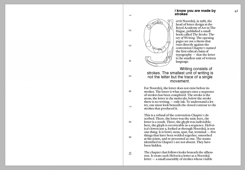
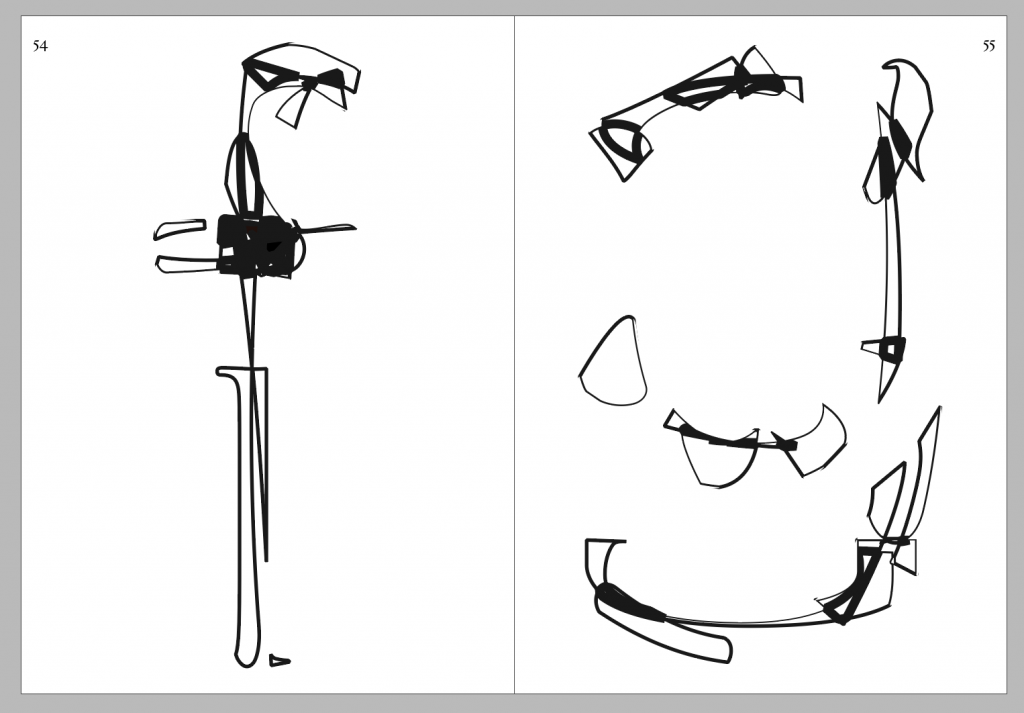
chapter 2 i know you are made by strokes-Breaking open the closed contours, reducing letters to pieced-together components and introducing the making process 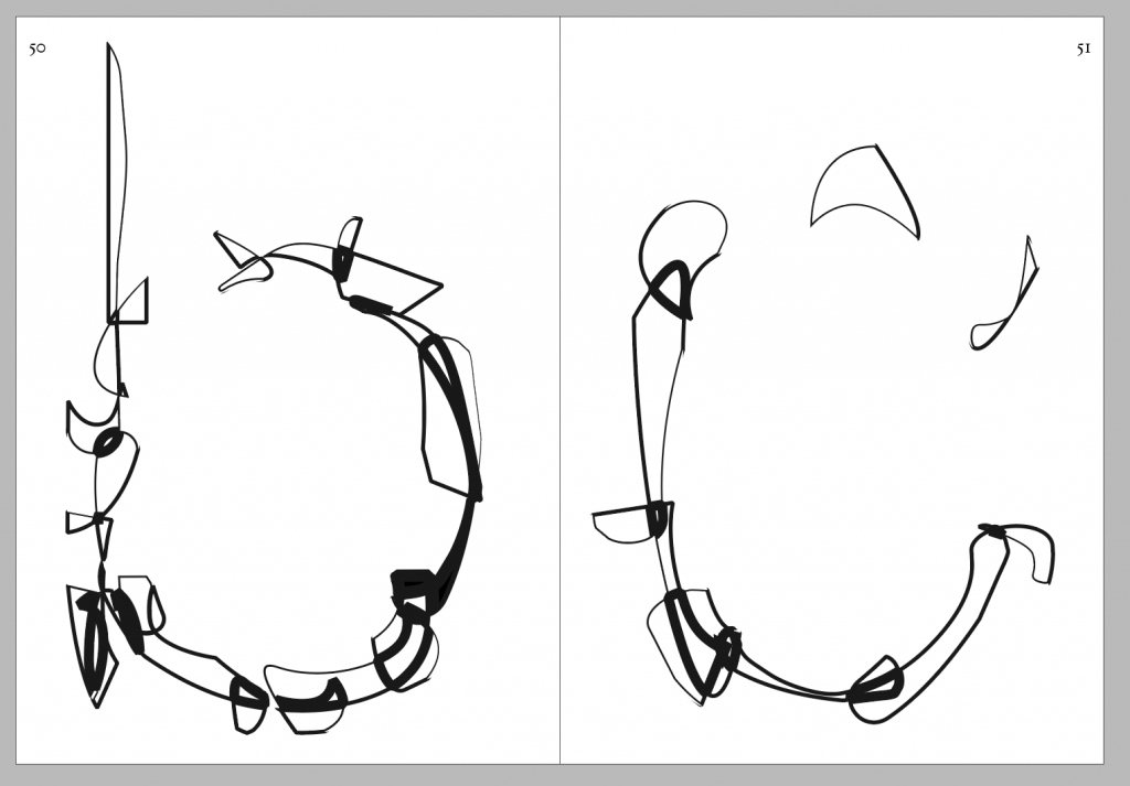
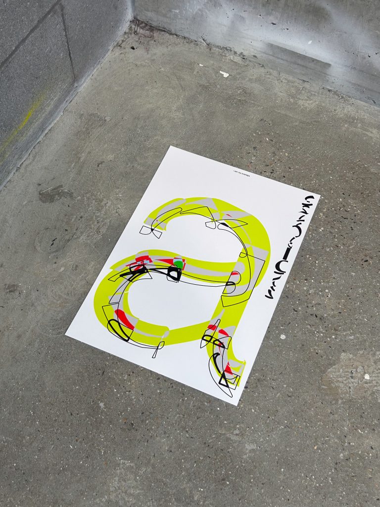
chapter 3 i am my overlaps-By stripping away the skeletal structure of the strokes, the ‘conflicts (overlaps)’ themselves become the sole visual entities to be read. 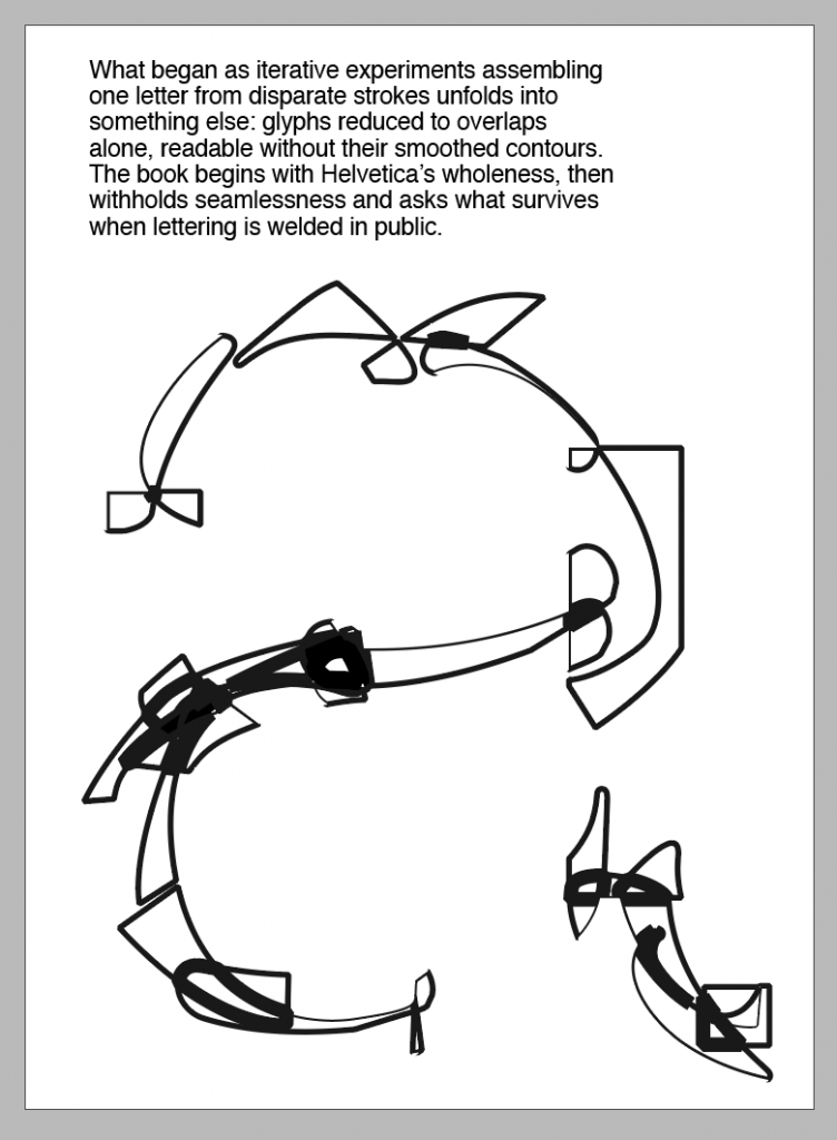
-
Positions through iterating
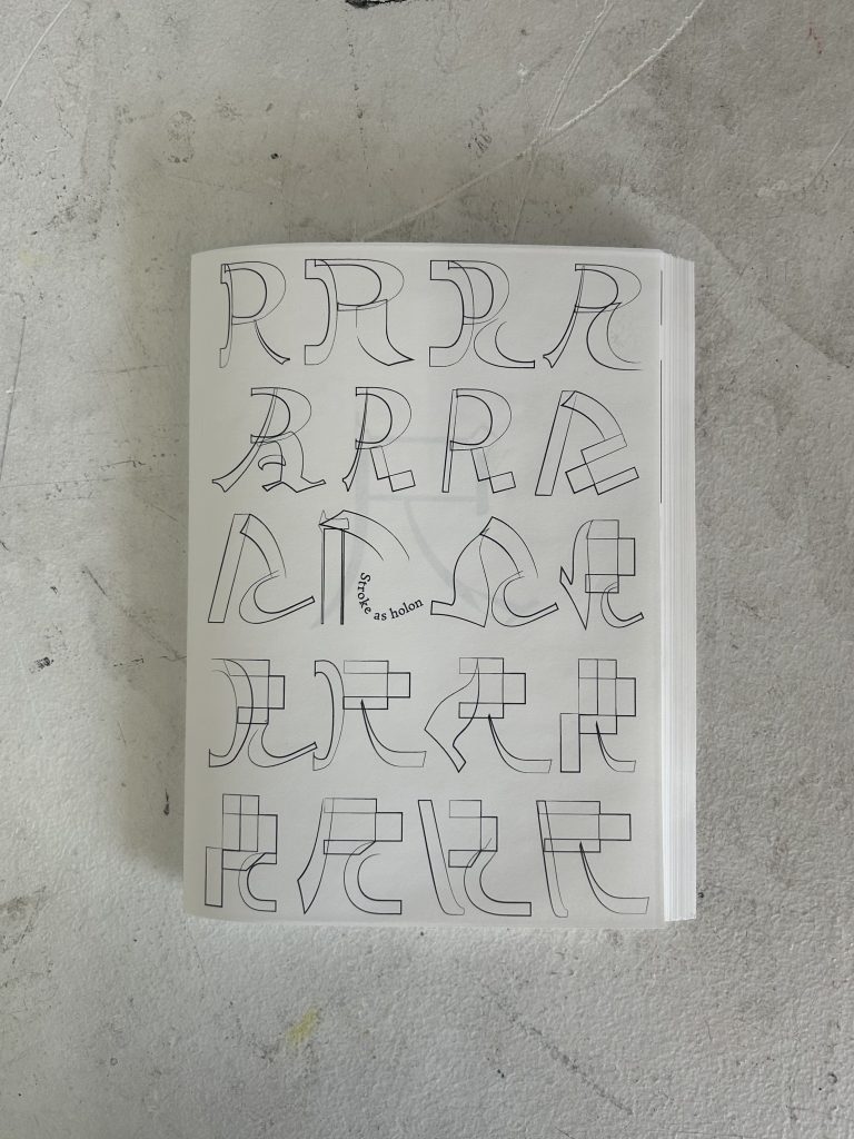
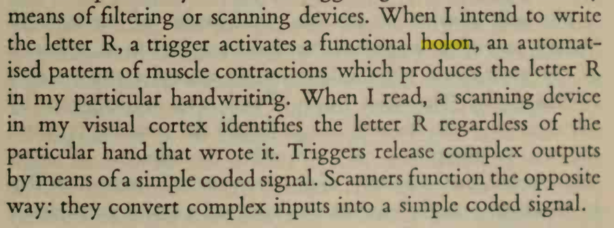
Such a beautiful coincidence that Arthur Koestler, the one who came up with the concept of holon also mentioned in that book of how writing R triggers a functional holon of human body. 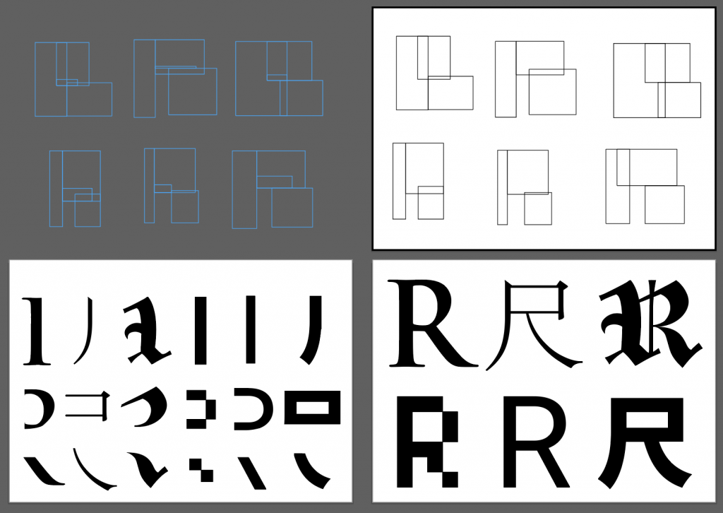
construction process of all Rs 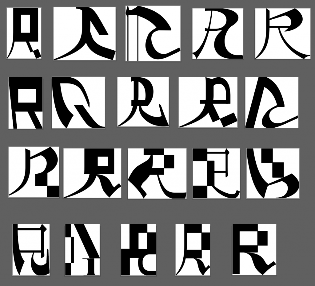
some good designs 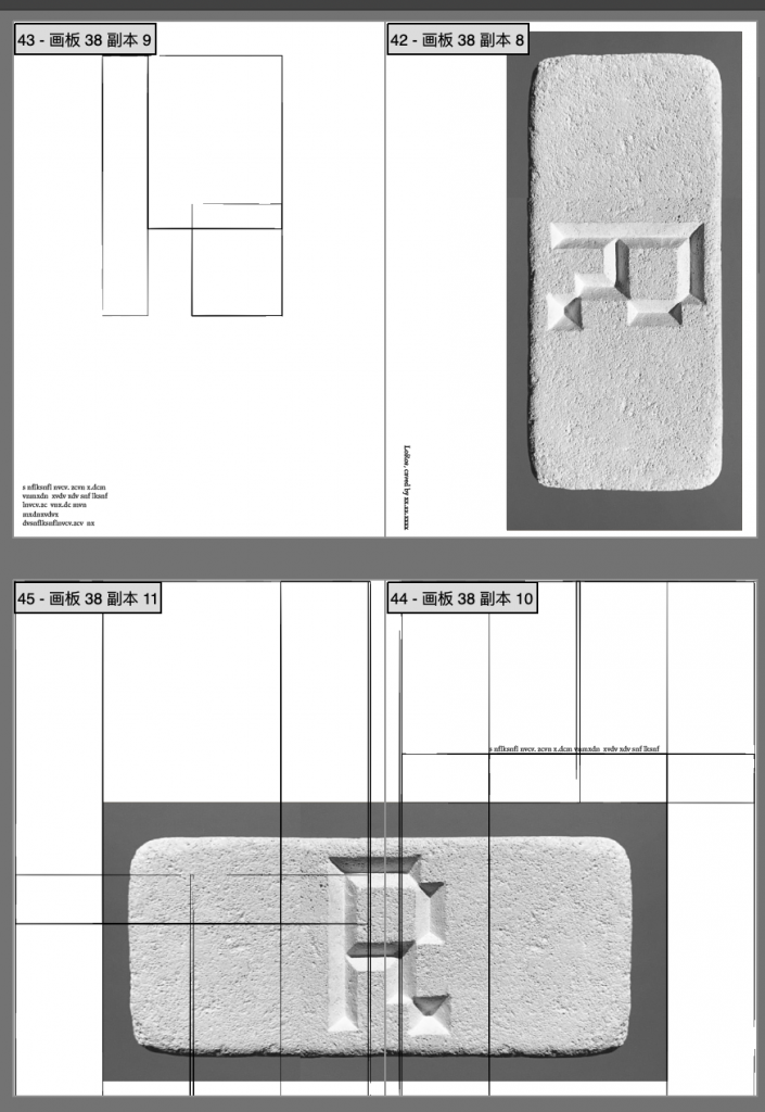
process of building the grid system 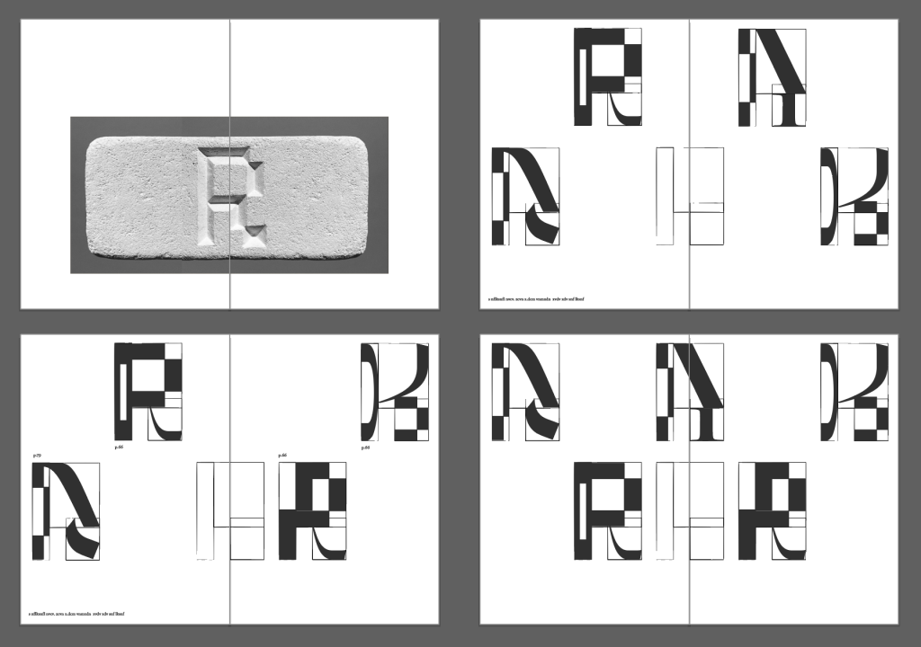
cover design 1 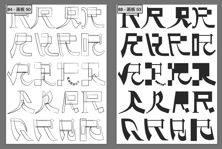
cover design 2 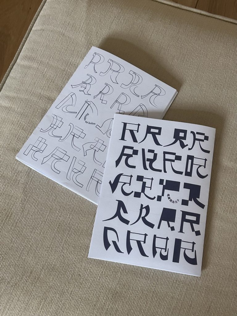
prototype 2 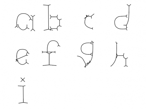
type in progress 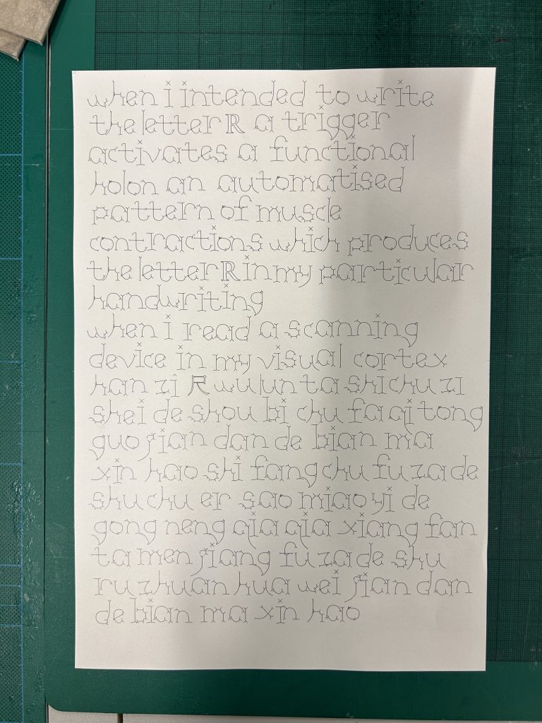
up: English down:Chinese 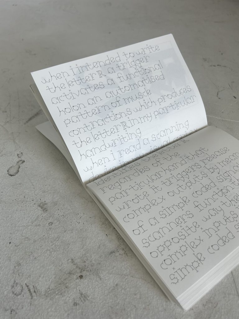
-
Methods of contextualising
https://editor.p5js.org/Tianlan.h/full/NmGCEsuM7 Net Zero Statement
Annotated bibliography
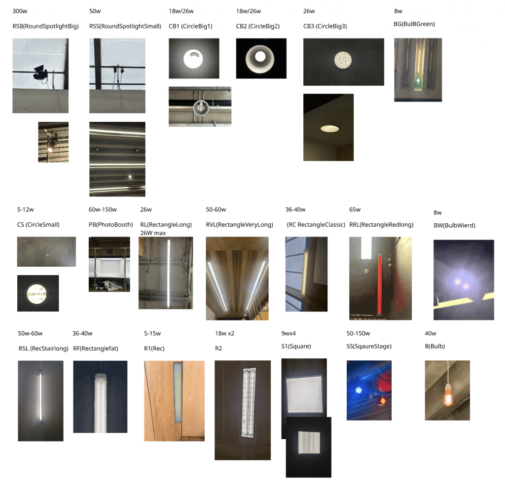
Original and compressed image of lights
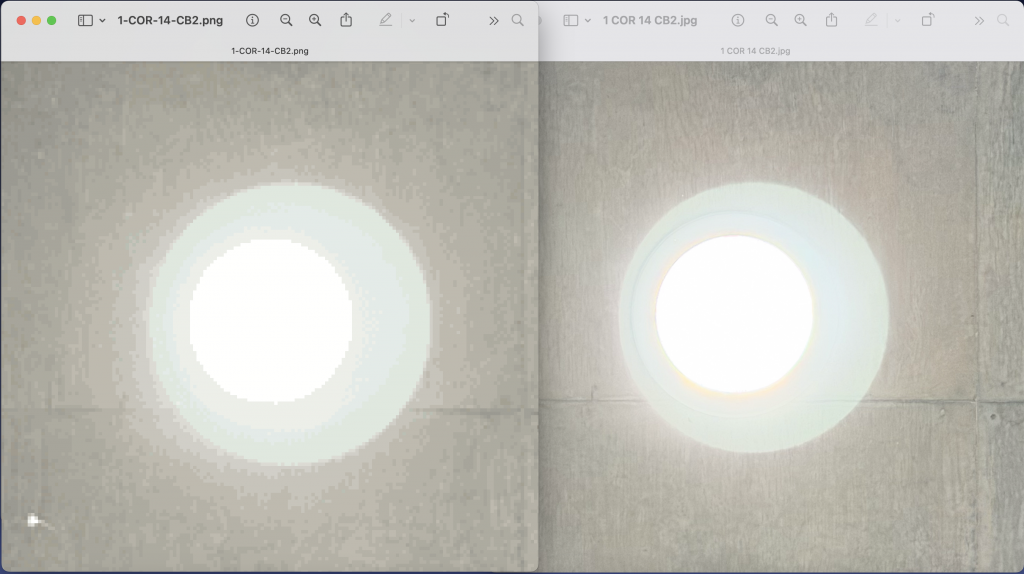
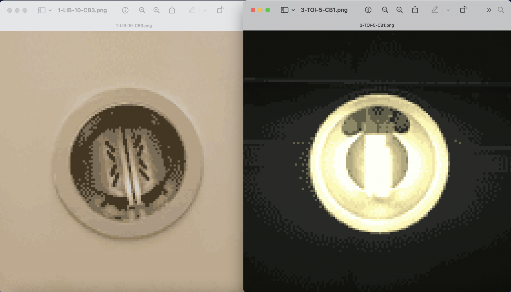
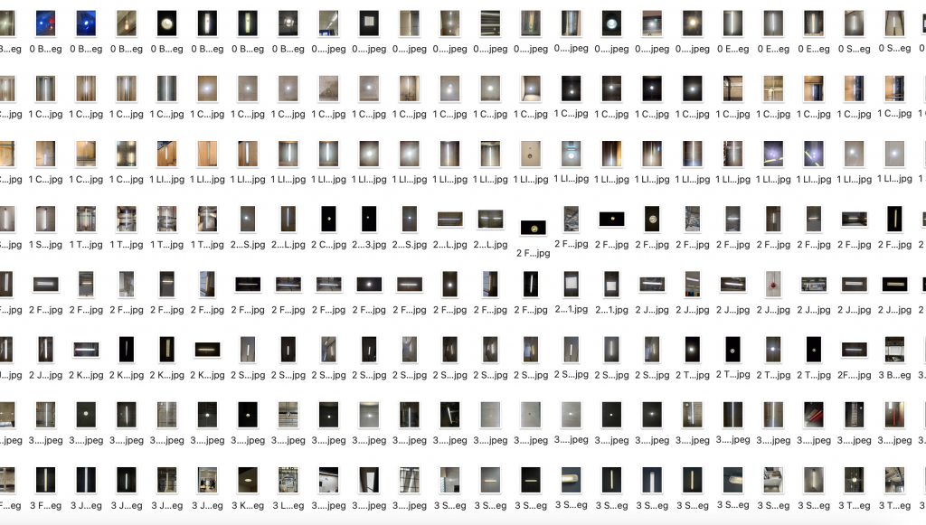
Photography by Vanya, Katka, Dingyi, Tianlan 20 types of lights in CSM
-
Methods of Iterating
Draft 1
Draft 2
Draft 3
Rationale for the Inquiry
Lacking prior experience in typeface design, I opted to eschew digital software in favor of investigating the discipline’s absolute historical foundations.
In my first tutorial, Zarna asked me why I chose stone carving over digital software, aside from just the historical aspect. I told her that working on a computer feels like designing a typeface, but stone carving is different, it allows me to physically experience the process of a typeface being created from the very beginning.
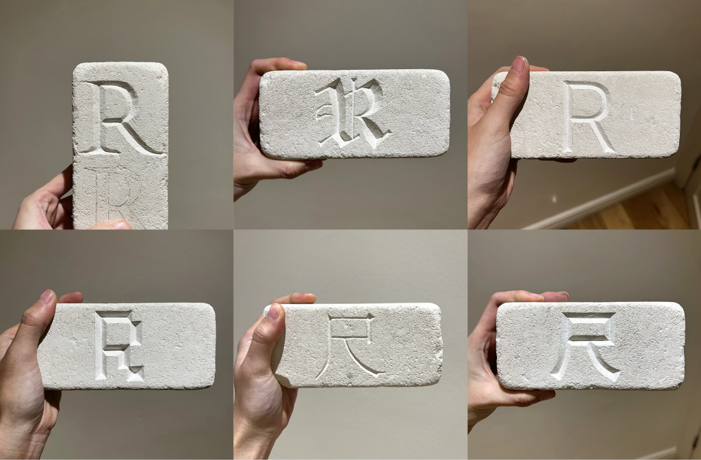
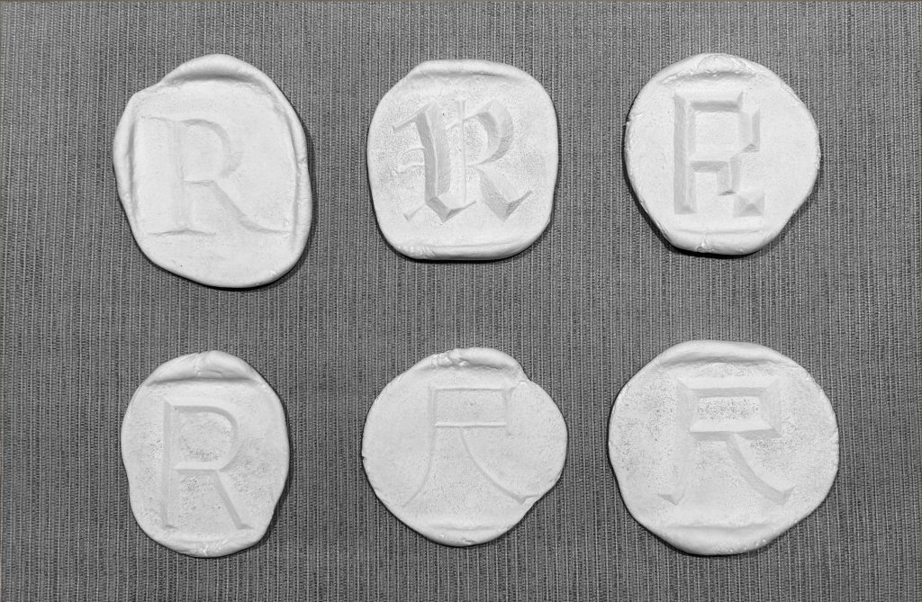
Through research into stone carving pedagogy, I identified a prevalent trend: the letter ‘R’ is frequently selected as the inaugural exercise for novices. This practice is notably visible in documentation from the Royal Academy of Art, The Hague (KABK), where workshop walls display a proliferation of student-carved ‘R’s.This pedagogical preference is theoretically grounded in Father Edward Catich’s The Origin of the Serif. Catich posits that the ‘R’ serves as the definitive technical assessment, acting as a morphological microcosm of the Latin alphabet. It synthesizes three distinct structural components: the vertical stem (akin to ‘I’), the curved bowl (as seen in ‘P’ or ‘B’), and the complex diagonal leg. Consequently, mastery of the ‘R’ implies a transferable proficiency applicable to the remainder of the alphabet.
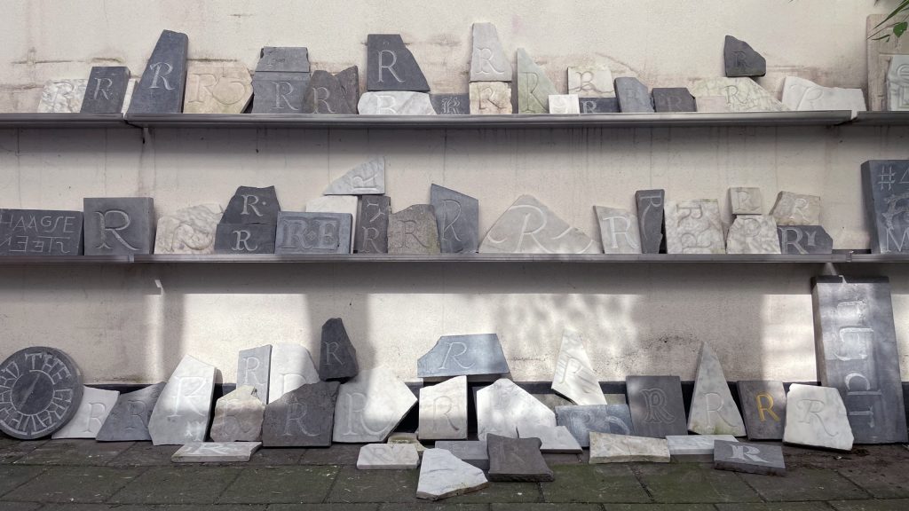
TypeMedia graveyard, at the Royal Academy of Art in The Hague. 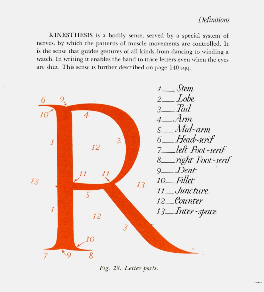
Rev. Ed-ward M. Catich. The Ori-gin of the Serif: Brush Writ-ing and Ro-man Let-ters. Dav-en-port, Iowa: The Cat-fish Press, St. Am-brose Col-lege, 1968 The copy piece
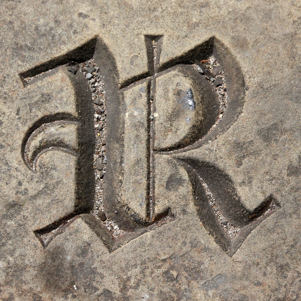
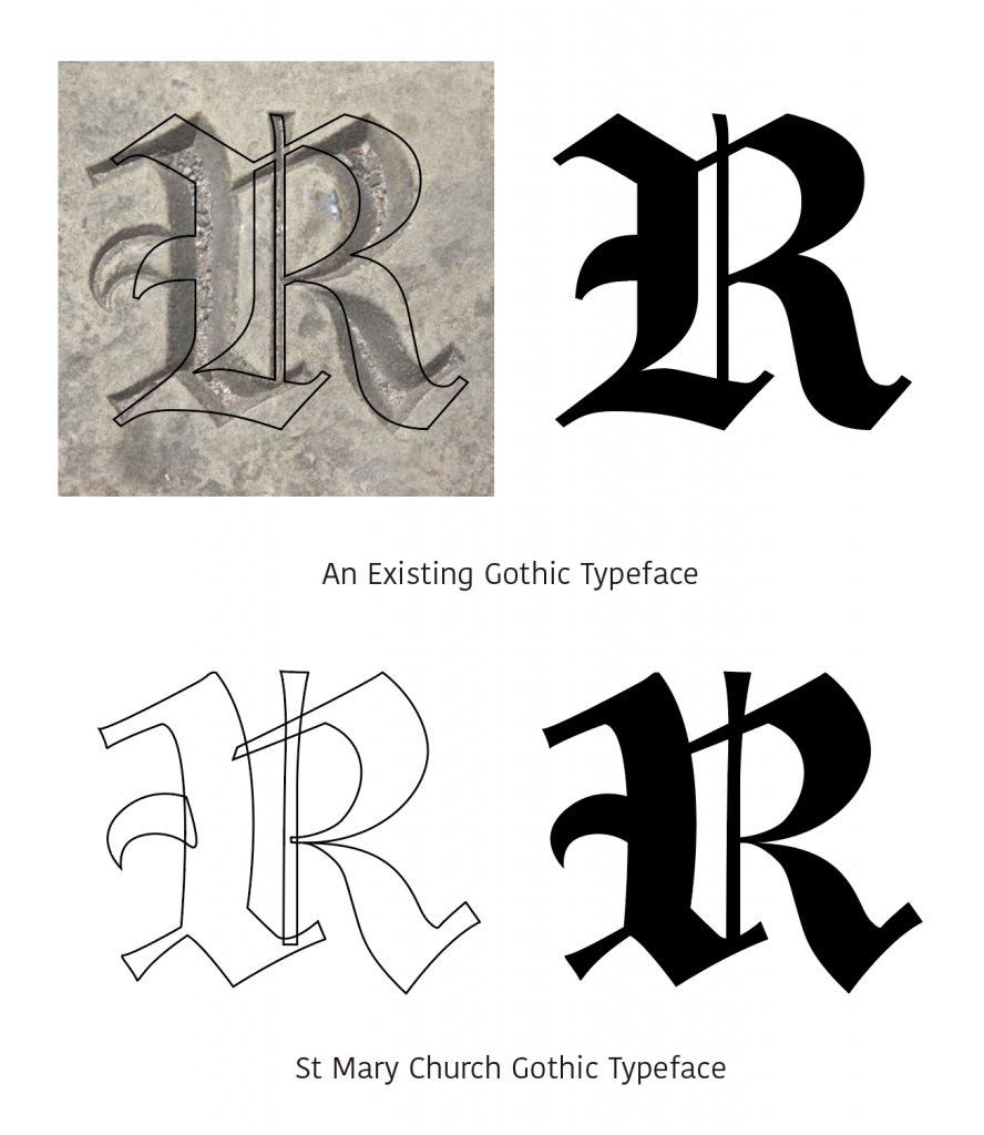
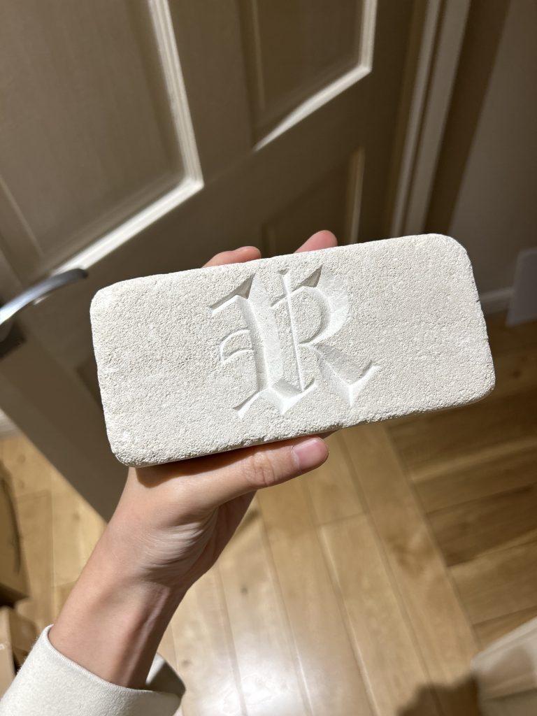
Informed by this rationale, I resolved to center my initial enquiry on the letter ‘R’. However, distinguishing my approach from the traditional Roman style, I selected a specific Gothic ‘R’ located at St Mary the Virgin Church in Manchester. This selection was strategic; unlike Roman monumental capitals, Gothic script is fundamentally calligraphic in origin. It was conceived for the fluid dynamics of the quill pen rather than the rigid subtraction of the chisel.
Translating this form into stone necessitates the transposition of fluid, pen-based gestures into unyielding matter. This approach tries to critically examine the material tension inherent in preserving calligraphic nuance through the subtractive process of carving.
St Mary the Virgin
Photo taken by Leo Reynolds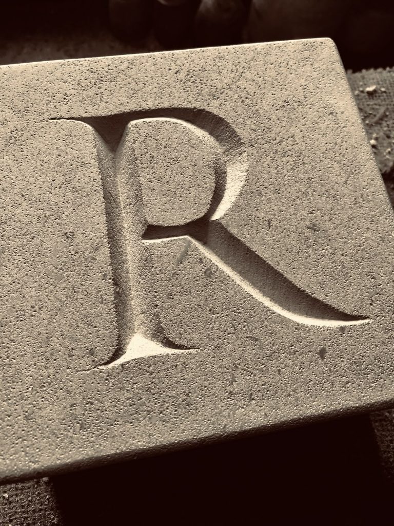
Carved by Andrew James
Bath stoneExercise of the Trajan R
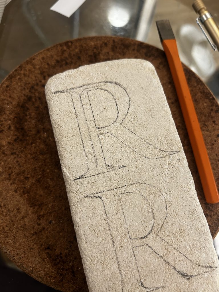
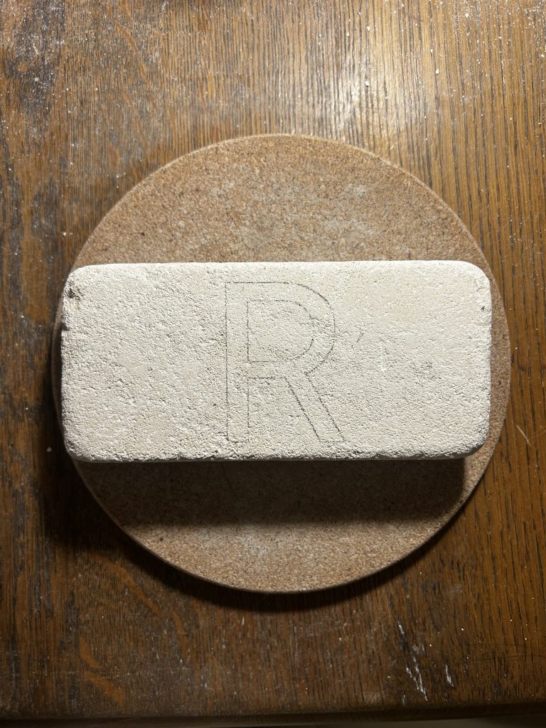
To replicate the intricate strokes of Gothic script, I chose to begin practising the most fundamental carving techniques with Trajan.
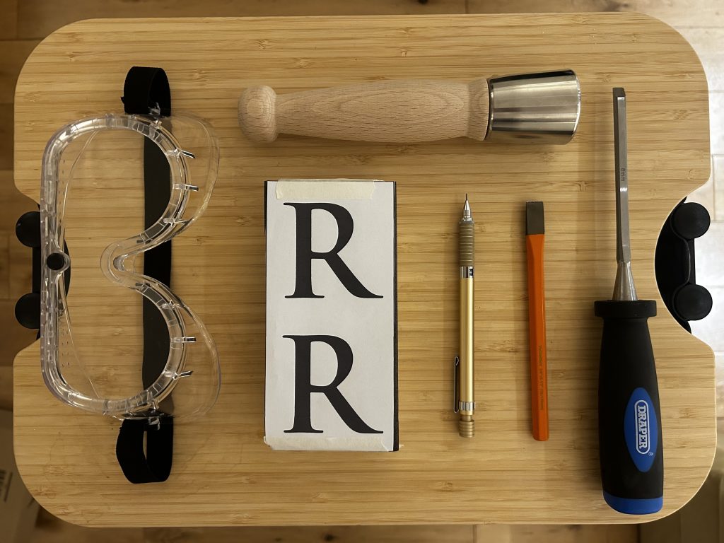
Tools used for stone carving from left to right: saftey goggles, a dummy hammer, a lime stone block with transfer paper covered, a pencil, a 12mm chisel and a 6mm chisel I traced the letter “R” from Trajan’s Column onto the limestone block using transfer paper and a pencil, and drew the centre lines of the strokes.
This was necessary because the carving would proceed from the central axis outwards towards both sides of each stroke.
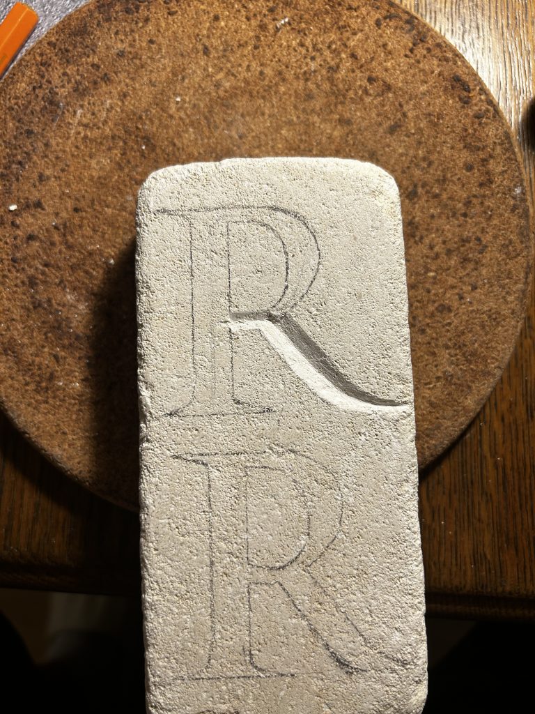
I started with the tail 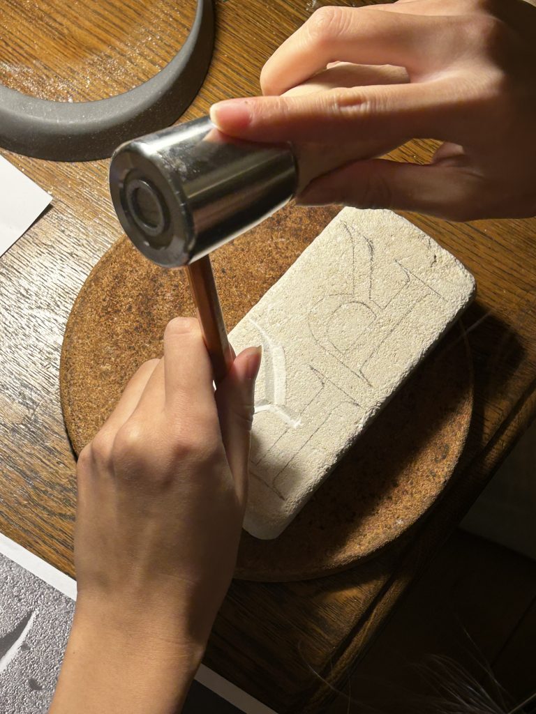
Then I carved the lobe 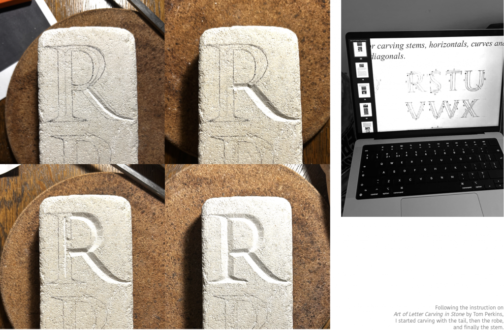
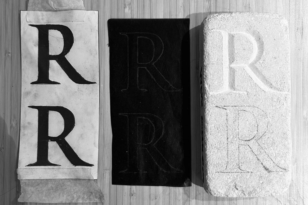
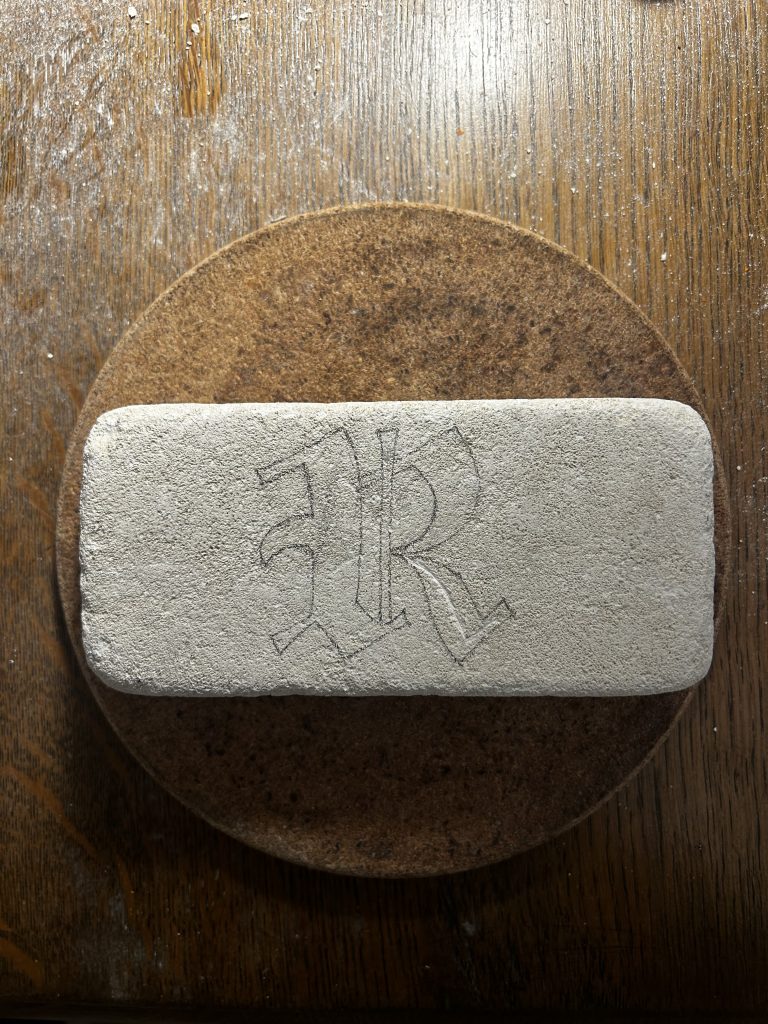
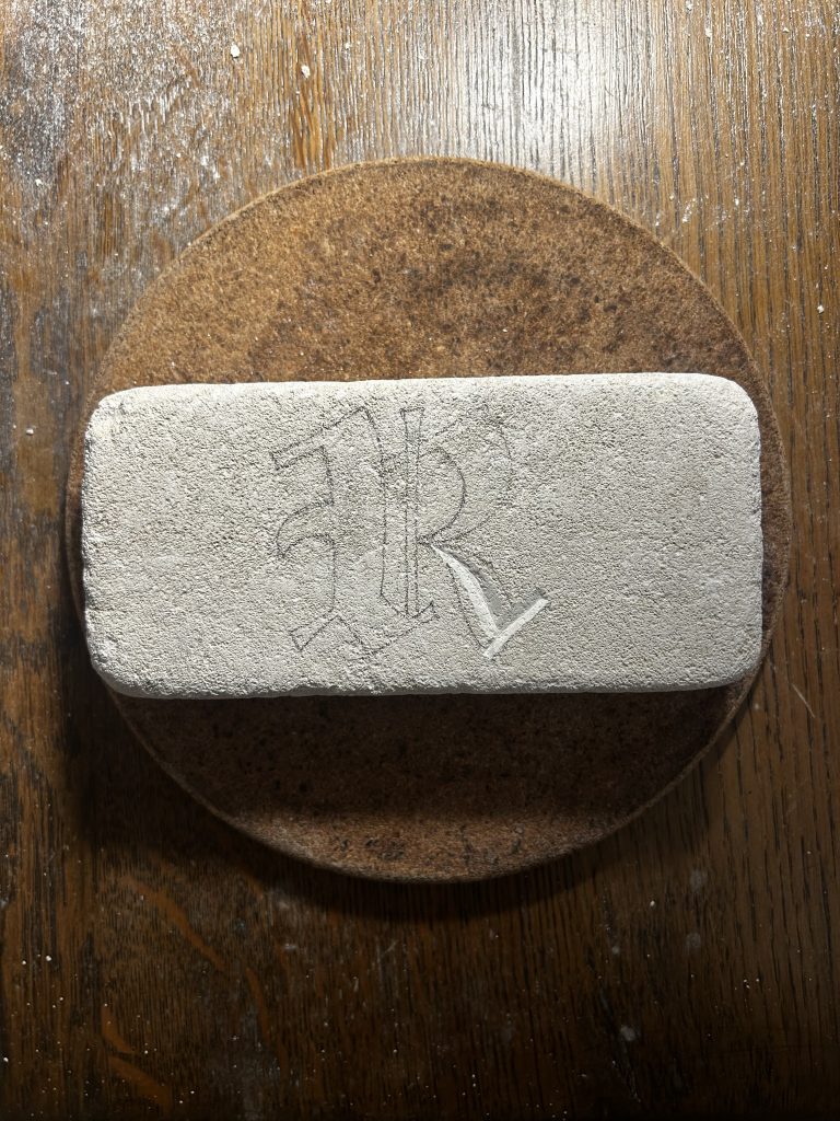
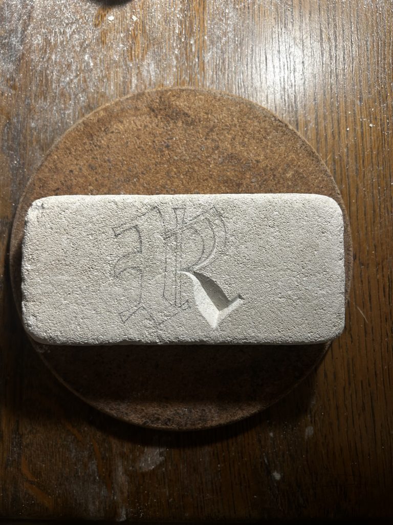
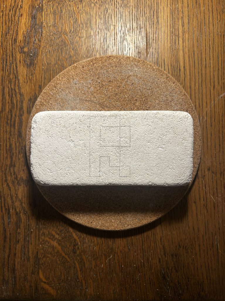
The Gothic R
I was unable to find the exact Gothic typeface that carved on St Virgin’s Church, so I reproduced it to transfer it on the brick.
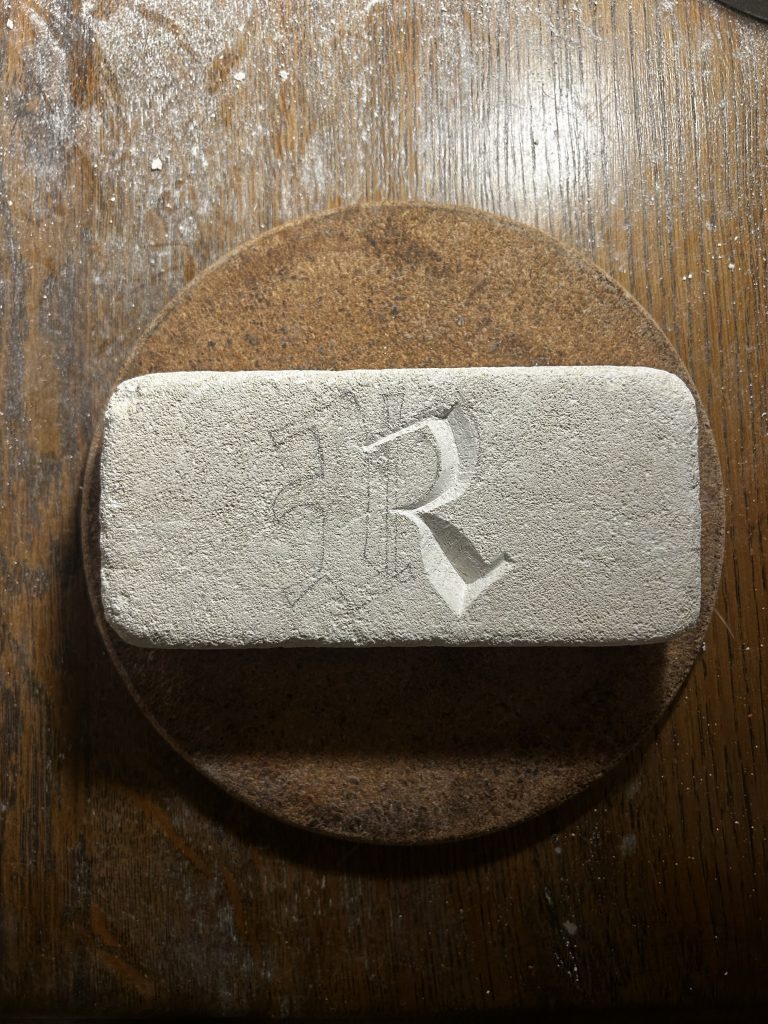
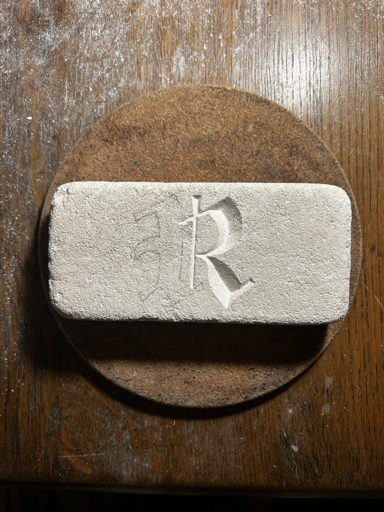
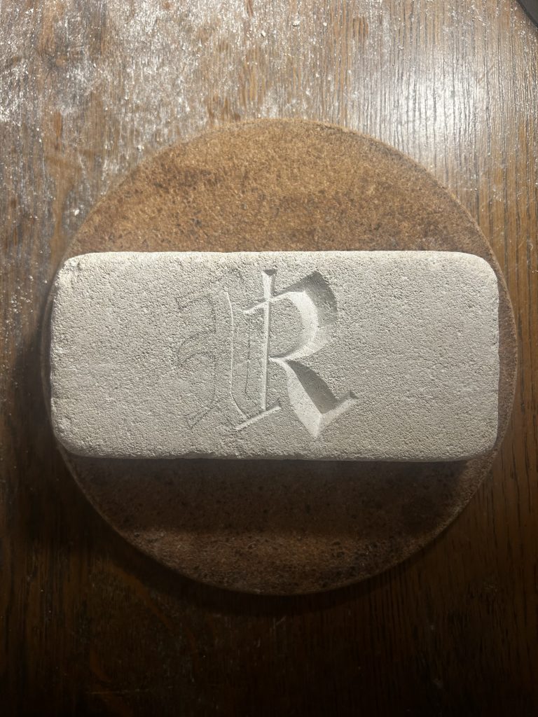
I’m glad that stone carving is not too hard for me 😀 By moving from the ‘native’ Trajan to the calligraphic Gothic R, it uncovered the rigid constraints of the medium. I found that while Roman capitals flowed naturally from my chisel, the Gothic forms forced me into a tedious process of sculpting negative space. This experience redefined typography for me as the fossilized memory of the tool that created it, whether that tool is a chisel, a quill, or any software.
Second Week’s Tutorial
Sharing my stone carving results with the group and Zarna elicited some unexpected reactions. They were surprised that instructional manuals for stone letter carving even exist. Interestingly, we discussed how these pedagogical resources seem exclusively dedicated to Roman Serif capitals. When asked if a Gothic guide existed, I confirmed it didn’t. In its absence, I appropriated the Trajan stroke order, specifically the bottom-up sequence (Tail → Lobe → Stem). This logic proved effective; it naturally accommodated the wrist’s torque, allowing for smoother execution of the curves.
While the feedback regarding content and linguistic bias was valid, Zarna’s advice to ‘keep constants’ resonated most deeply. It connects directly to our understanding of Conditional Design: randomness is not about abandoning control or allowing arbitrary outcomes, but rather defining the specific scope in which variation occurs. This insight compels me to approach next week’s iterations with a much more rigorous framework.
Hacking into digital era
Defining ‘hacking’ as the imposition of modern, sans-serif logic onto a classical material, I chose Roboto and the pixel font LoRes to explore how the stone reacts to these foreign, screen-born aesthetics.
Roboto
Roboto Regular 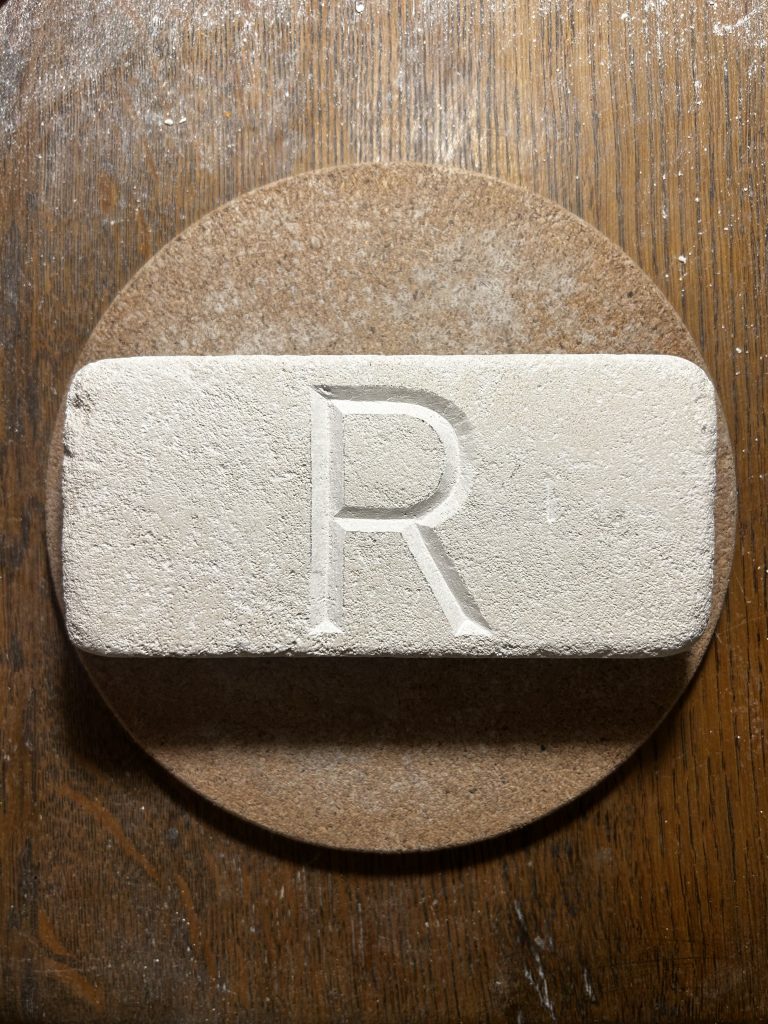
When carving Roboto, I noticed it somewhat resembles Trajan without serifs or tail curves, and their stroke weights are quite similar.
However, the absence of serifs makes this a more challenging font to carve. Without serifs to provide turning points for the chisel at stroke junctions, I must refrain from carving strokes to their full extent at these points. Only after the subsequent stroke is carved can I gradually chisel out the precise shape of that corner.
LoRes
LoRes 9 OT Narrow Regular 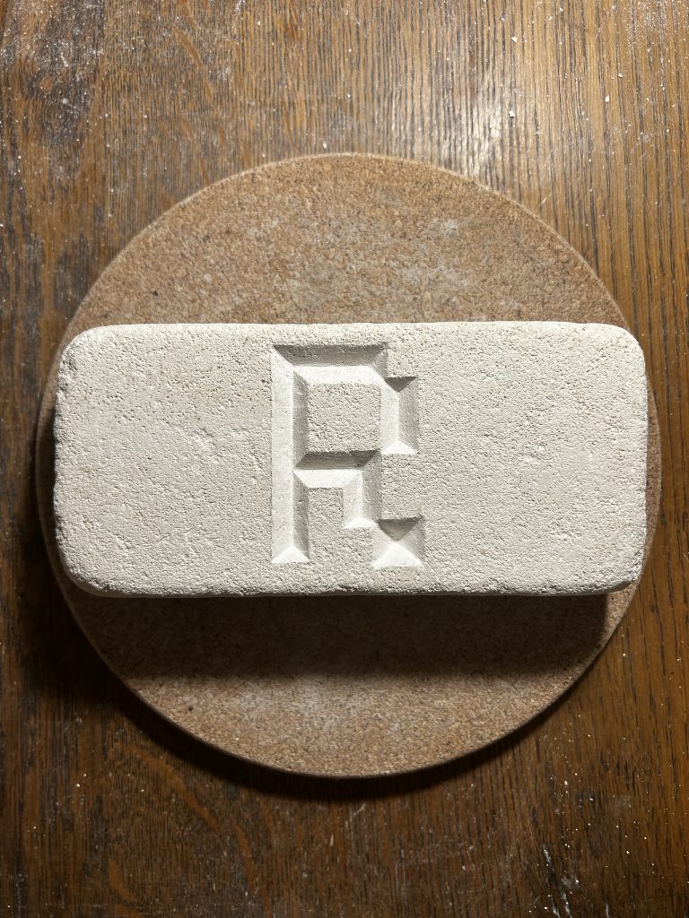
I never imagined carving pixel fonts would prove the most challenging. I had underestimated the difficulty of it because pixelated font contains no curves at all. Yet this very feature became an obstacle to smooth carving, I had to constantly keep my left wrist (the hand holding the chisel) completely still while my right hand continuously struck the chisel with the hammer.
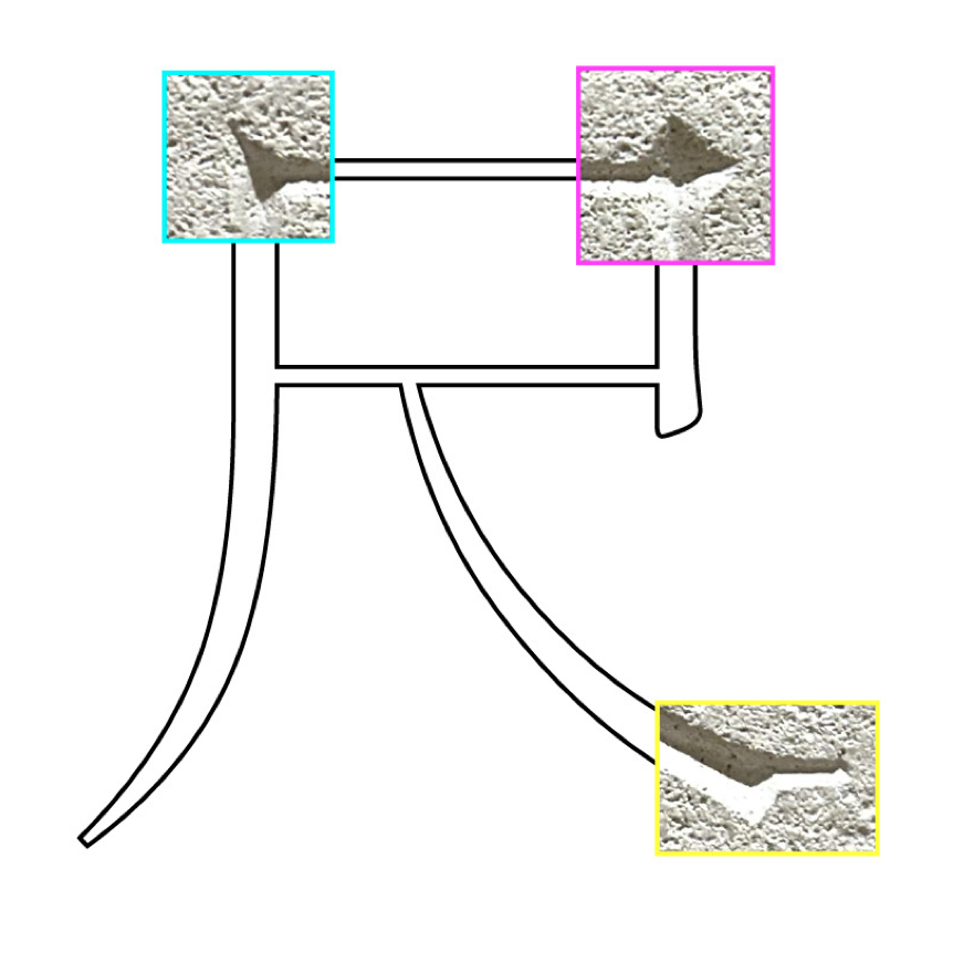
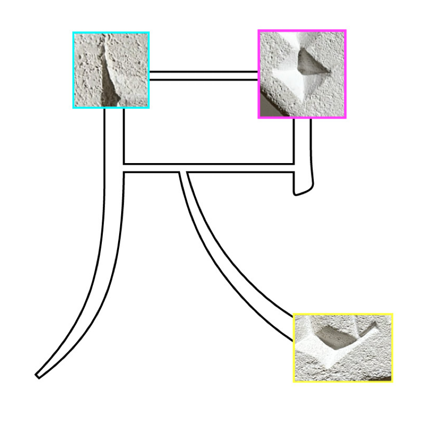
Simultaneously, the isolated square in the lower right corner of this pixel font proved the most challenging structure I’ve ever carved. With no reference materials to guide me on how to handle it, I could only guess with the chisel, carving outwards from the center of the square. After carving, this block originally 9.5mm wide, ended up 11mm wide.
Carving Chinese characters
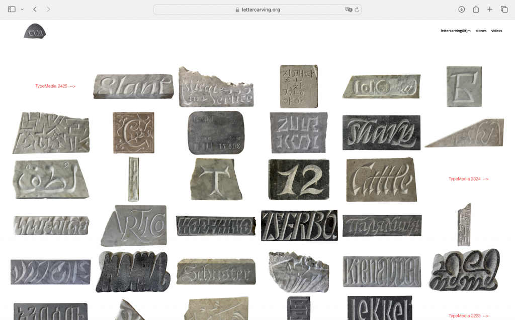
Webpage of the stone carving workshop for Type Media students at the KABK While conceptualizing the iteration plan, I revisited the KABK stone carving workshop website and noticed that many students carved not only English but also other languages. For instance, this image shows Korean, Arabic, numbers, and even emojis. This inspired me to carve Chinese characters next.
R & 尺
Compared to frequently hand-writing English, I’ve almost lost the habit of writing Chinese characters. Rediscovering the act of ‘writing’ Chinese through stone carving might be a unique opportunity. Moreover, exploring how stone carving evokes different experiences for carvers across various languages excites me greatly.
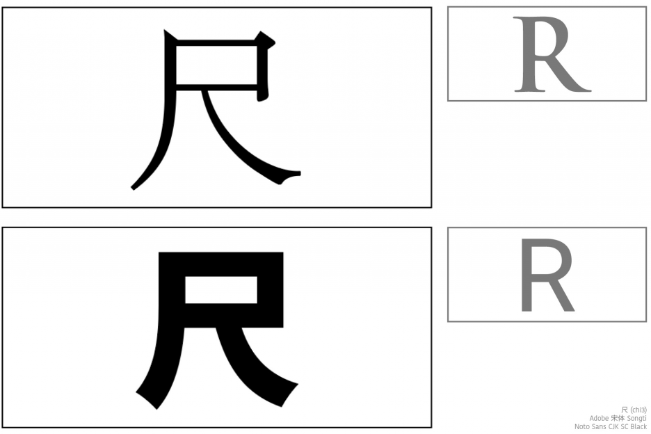
I’m thrilled by this coincidence—in Chinese characters, ‘尺’ (Chi3) bears a striking resemblance to the letter R. This character means “ruler.” I selected Songti (宋体) and Noto Sans (a sans-serif font) as counterparts to Trajan and Roboto.
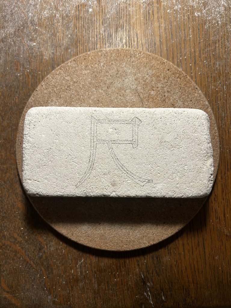
Noto Sans CJK SC Black 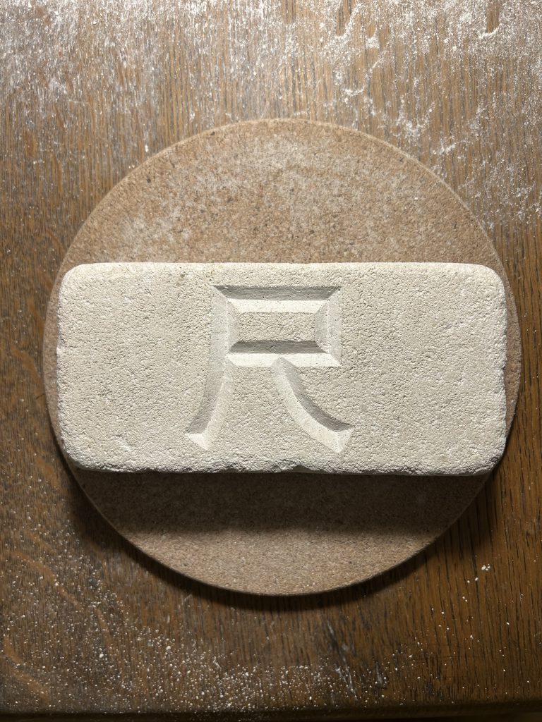
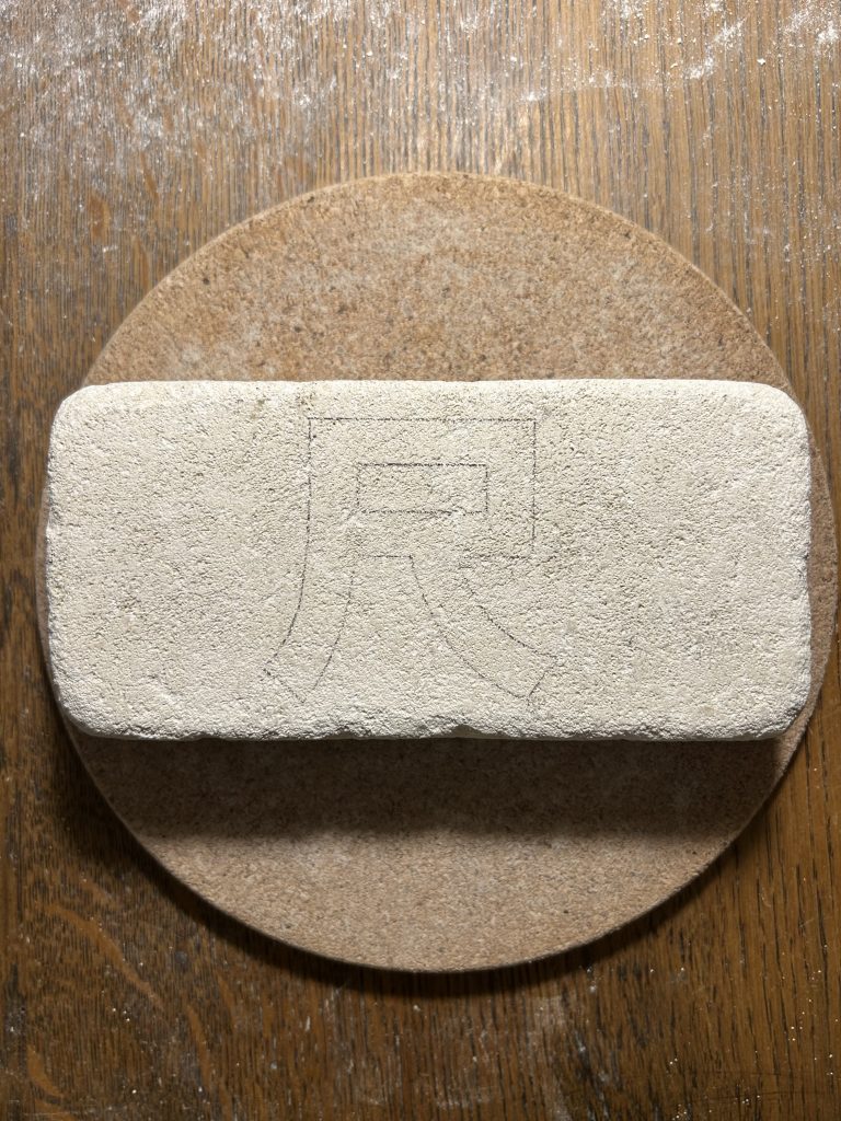
I assumed that carving the sans-serif character 尺 would feel more like carving Roboto, but it reminded me more of carving the LorRes. The broad strokes demanded just as much force and time to carve out.
Adobe Songti 宋体 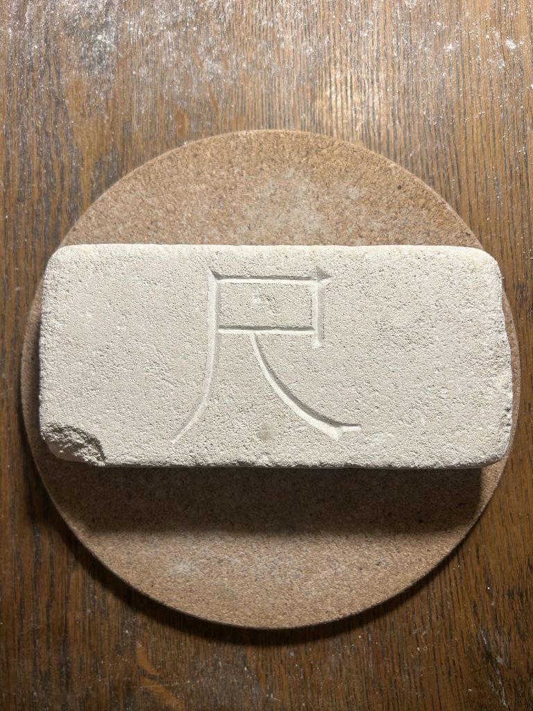
As I carved this final character, I was struck by how consistently stone carving transcends linguistic boundaries. When strokes were thick, I had to apply more force to carve them deeper; when strokes curved, my wrist had to follow the curve’s curvature; and serifs were always easier and simpler to carve than sans-serif characters.
I used super-light clay to take impressions of the carvings, translating the recessed lines into raised reliefs. This allowed me to examine their internal structures as positive forms. 3 Similar carving structures between 尺 & R
The left side shows the original structure of 尺 on the stone carving
The right side shows 尺 replaced with the structures that similar to R

The Pyramidal Cut
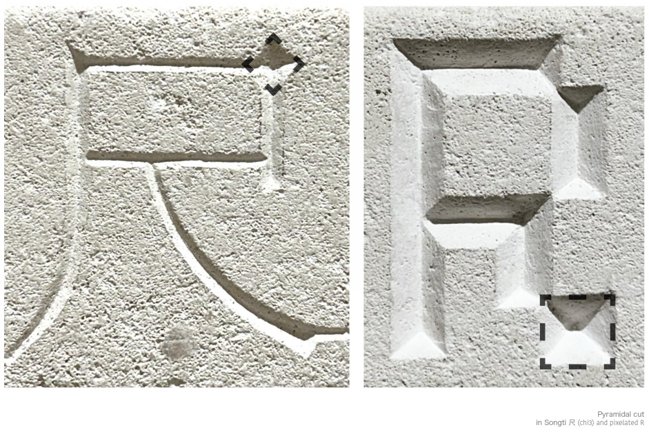
In the magenta section of the preceding comparison image—the area outlined by the black dashed line in the figure above—a striking similarity emerges. One is a serif Chinese character, while the other is a pixel-based English letter. In this structure, both required me to drive the chisel’s point vertically into the surface. Upon researching, I discovered this carving technique is termed as pyramidal cut within the Western stone carving context.
This term recalls my experience in Dendera Temple of Hathor, Egypt, where I observed how the ancient Egyptians inscribed hieroglyphics upon the stone walls, columns, and even ceilings, affirming stone carving as a timeless universal vessel for language.
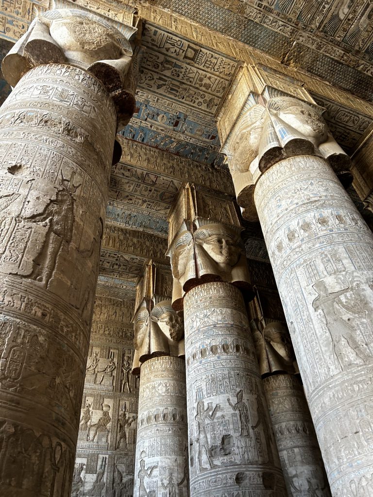
A photo taken by me in the Dendera Temple of Hathor Stone carving demands a specific kinetic response to every structural problem, regardless of whether the form originates from the fluidity of paper, the grain of the woodblock, the primordial nature of stone, or the rigid grid of the screen.
It is this structural homology that I aim to visualize in a single, unified stone carving. At the same time, I am intrigued by how the chisel interacts with scripts that are foreign to me. While I have examined countless inscriptions dedicated to single languages, the Rosetta Stone remains the singular historical precedent that forcibly juxtaposes distinct writing systems onto a shared material plane.
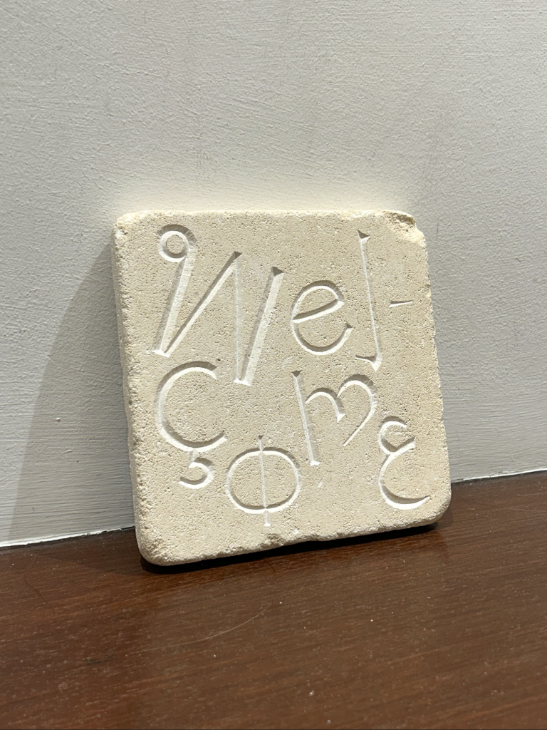
Welcome
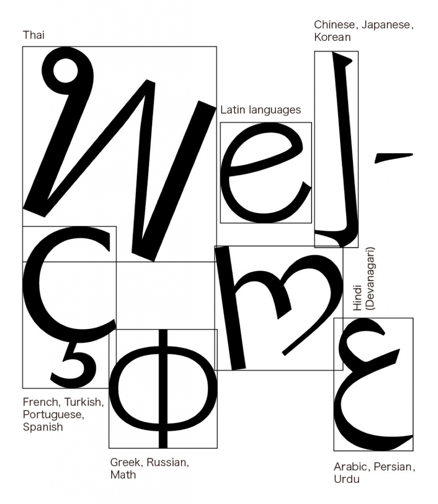
When choosing the word, ‘Welcome’ instantly came to mind. It captures exactly how I felt about the craft: stone carving felt like an invitation to me, and essentially, an invitation to everyone.
For the composition of the word, I chose languages that are personal to me, mixed with the languages spoken by my immediate circle of friends and peers.
-
Methods of Translating
Screen recording for pg. 20 of Midpoint Assessment
Screen recording for pg. 23 of Midpoint Assessment
Screen recording for pg. 24 (left) of Midpoint Assessment
Screen recording for pg. 24 (right) of Midpoint Assessment
-
Methods of Investigating
A path in Kensington Garden between Lancaster Gate and Porchester Gate, the path faces the park and backs onto the street.
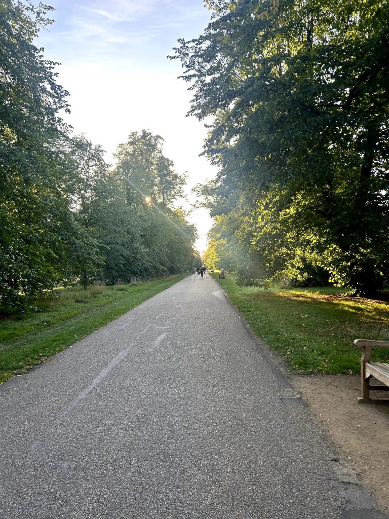
Week 1 24/9-25/9
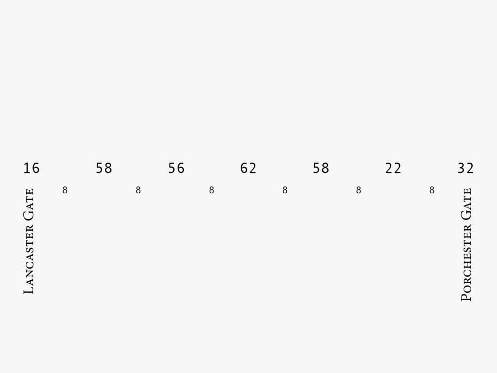
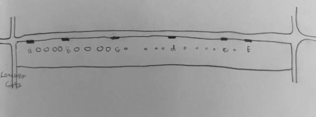
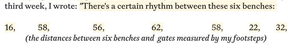
Along this path, there are six benches. I measured the distance between each bench and the gate by counting my steps, using these measurements to create an overhead map.
Then, I sat on each benches, naming A-F, two initial investigation methods were conducted: sound map and note-taking.
A
Driven by pure curiosity, I record any sound I can hear.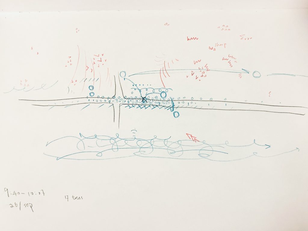
I centered myself and used hand-drawn graphics to rapidly document the types of sounds I could hear over a period of time. At the same time, I recorded natural sounds in red and unnatural sounds in blue. 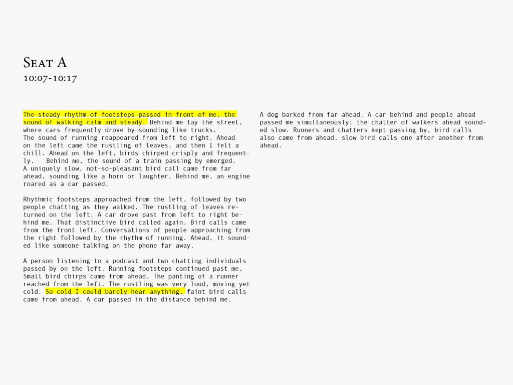
At first, I simply taking down all of the sounds that I can hear, for example, the steady rhythm of footsteps or the not-so-pleasant bird call. B
Perceive sound types and actively distinguish them through graphical means and note-taking.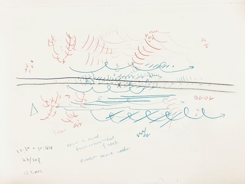
The sound of leaves rustling in the wind is recorded as the waveform. Bird calls primarily follow a
V-shaped pattern, with adjustments made for distinct vocalizations, for instance, the o v o v call is clearer than the v v v v call.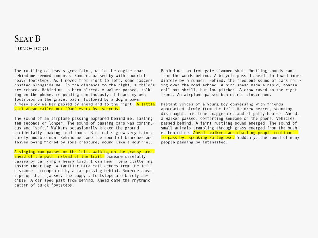
As I took notes, my attention to sound gradually shifted from nature to human voices. C
My attention began to transcend the sense of sound.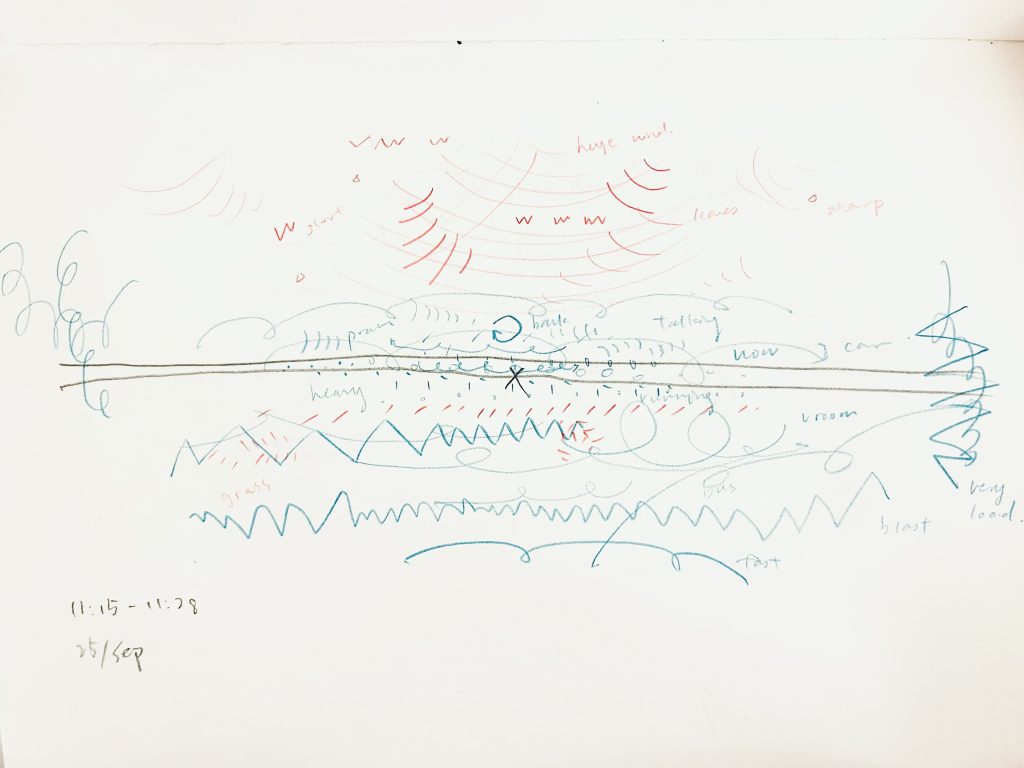
The sharp, raucous honking of cars made me record their sounds as wwww, while all wheel-related noises were captured as ➰➰➰➰. 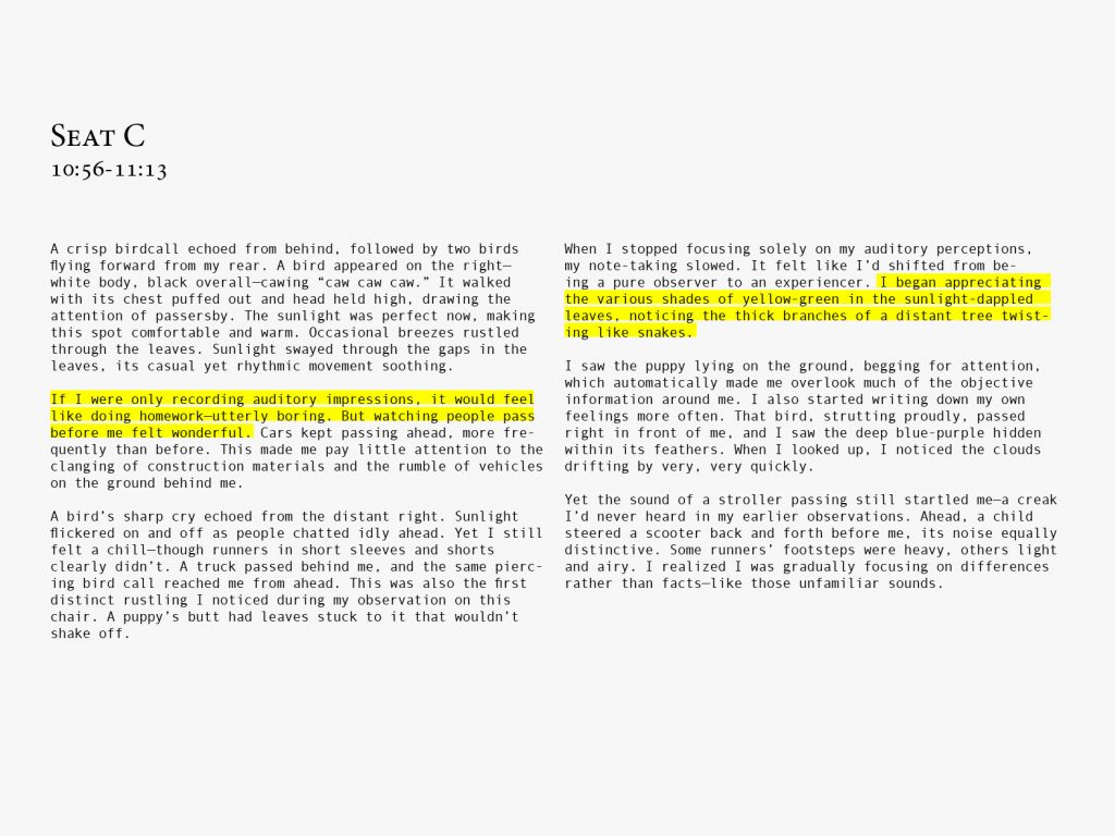
I began to record things beyond sound, the yellowish-green of leaves illuminated by sunlight, and branches twisting like snakes. F
I noticed that my mood alters my attention to things.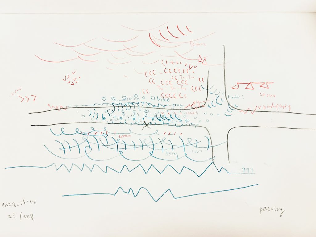
The crow’s call was first transcribed by me as ▵–▵–▵–, owing to its long notes and brief intervals. 
My cheerful mood led me to notice the similarity between pigeons and cats: they both pretend to be busy. D
A more refined notation system.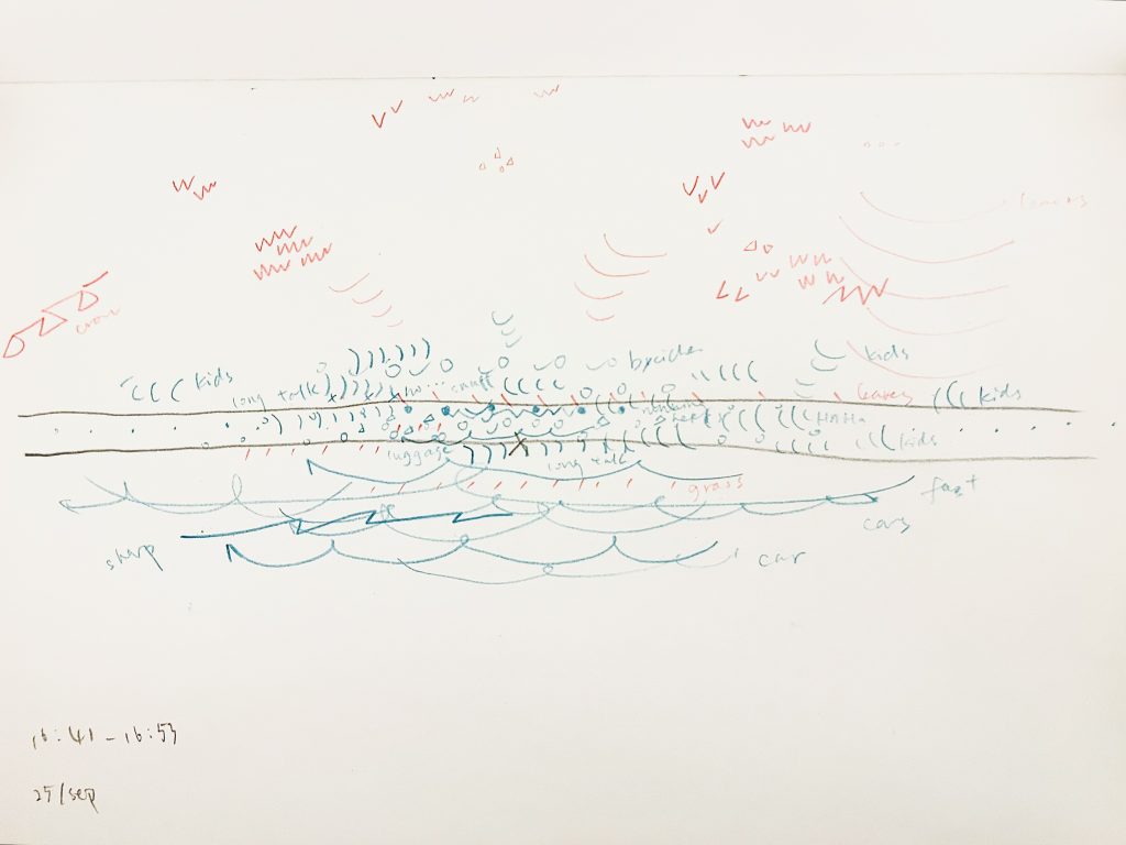
I used ●●●● to denote the rapid footsteps of running and ○○○○ for the leisurely pace of strolling. For the first time, I began annotating the origins of these symbols beside them, to better understand my own intuitive notations. 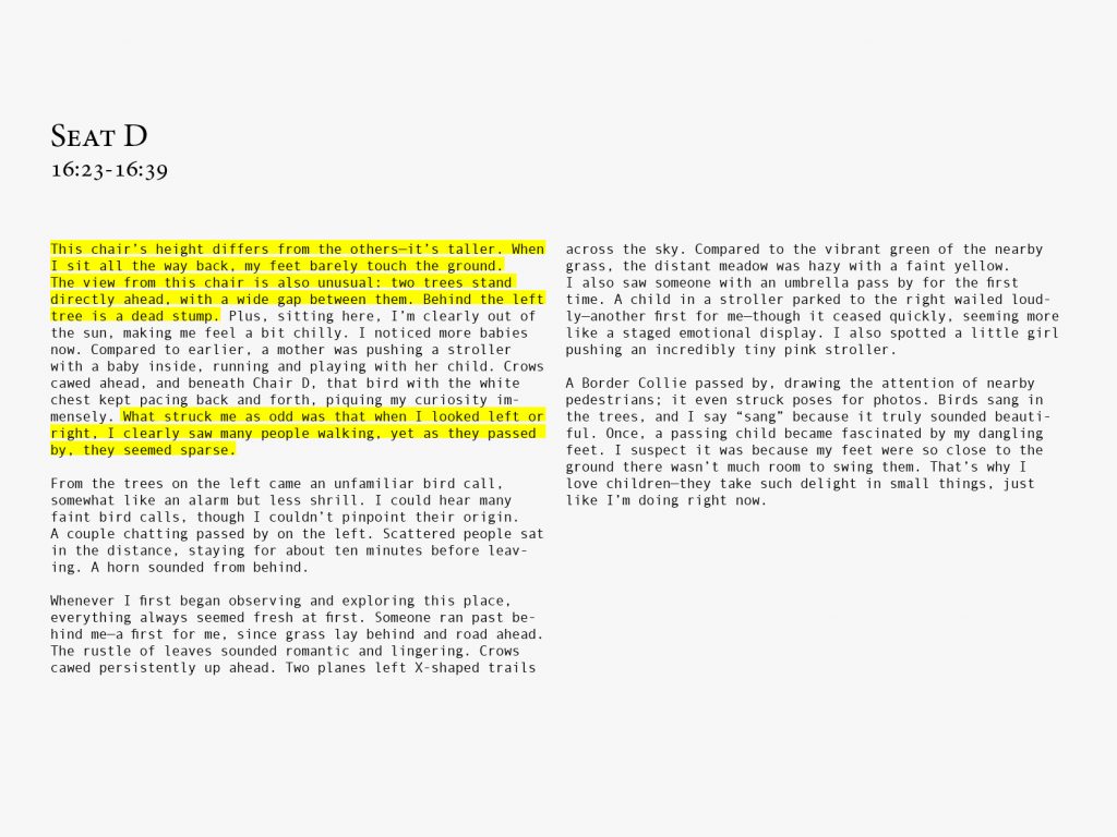
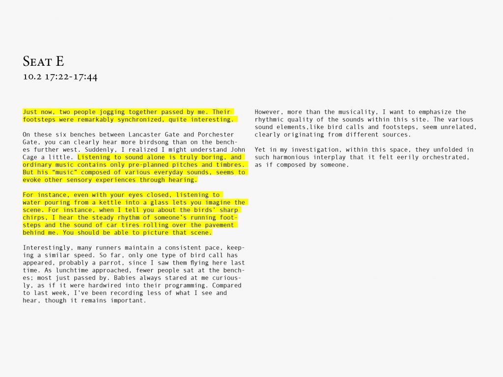
I notice how the height of the bench affected my observation, subtly altering my field of vision and posture. E
The rhythmic quality of the sound is particularly noticeable upon my investigation.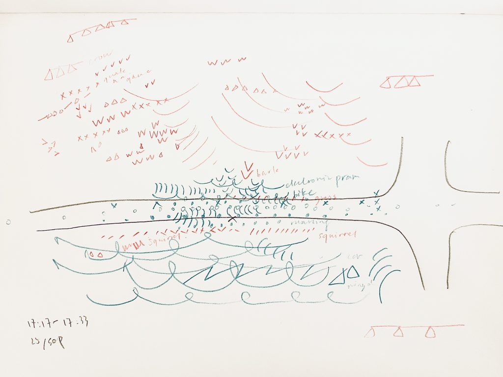
The bird call notation system has been updated as follows: Initial v v v v, clearer and fuller o v o v, crow’s ▵–▵–▵–, magpie’s x x x x, and sharper w w w w. 
Despite the seeming randomness of individual occurrences, their recurrence and rhythm exposed an underlying order so rigid that it felt uncanny rather than harmonious. 
Conclusions on my 2 investigation methods. Feedback
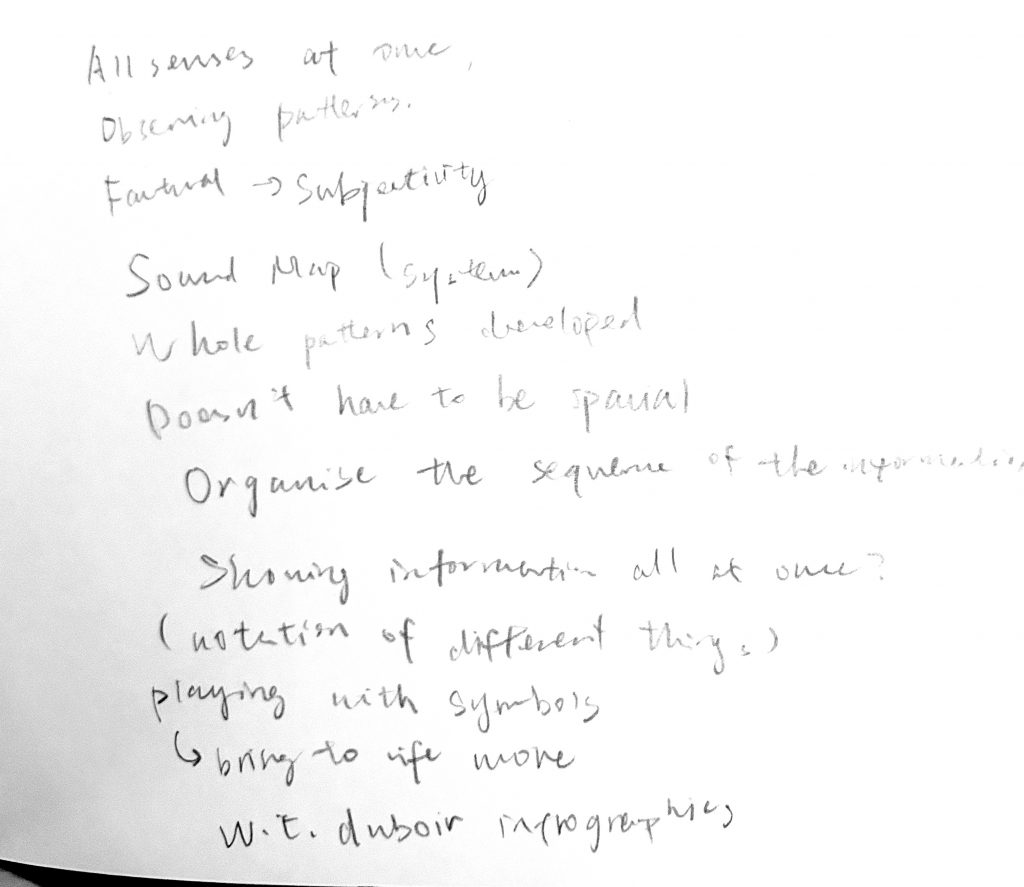
I do feel that the spatiality in the sound map are not the most crucial element. I concur with this suggestion and put it into practice the following week. 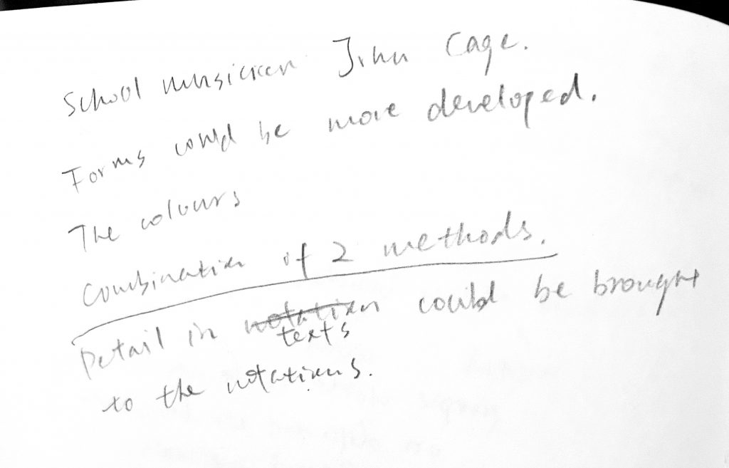
I also agree that I should combine both investigation methods: the visual form of the sound map with the contemplative note-taking. Week 2 26/9-3/10
I want to express the regularity of the rhythmic patterns within this cite through rhythmic stave, which could be considered as an upgrade of the sound map that abandoned its spaciality.
Through note-taking, I have once again summarised the limited types of sound present within this site, and aim to express them through rhythmic notation: footsteps, birdsong, rustling leaves, the sound of wheels, horns, conversation, the crunch of grass, and aircraft noise. Storytelling rhythmic stave with more notations
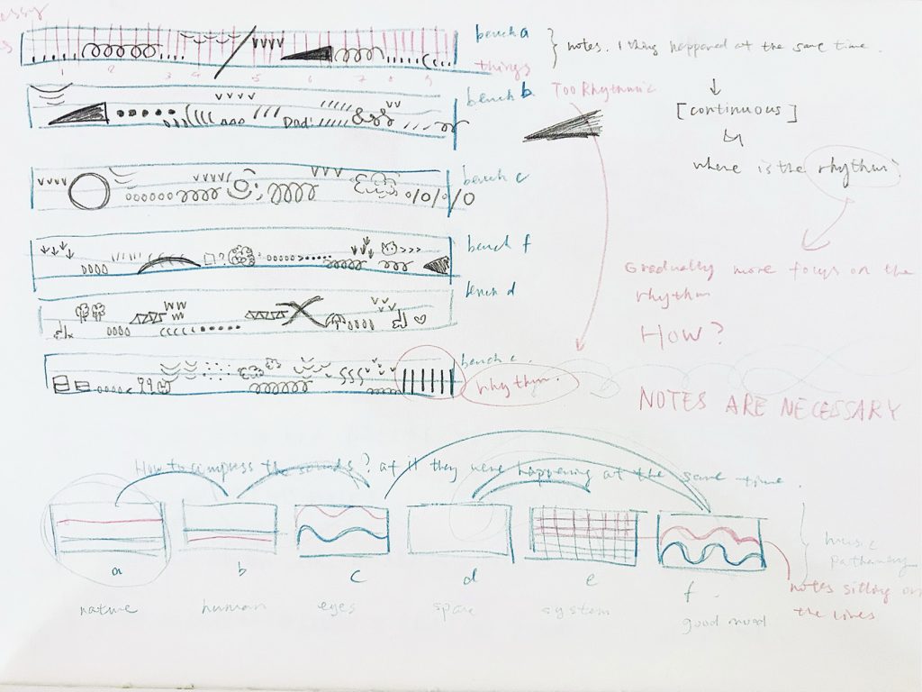
The horizontal axis of the chart represents time, while the vertical axis represents pitch. I employed more specific, narrative-driven notations to convey my findings. For instance, when mentioning pigeons, I drew bird claws; when describing an infant’s cry, I depicted teardrops. Storytelling rhythmic stave with typography
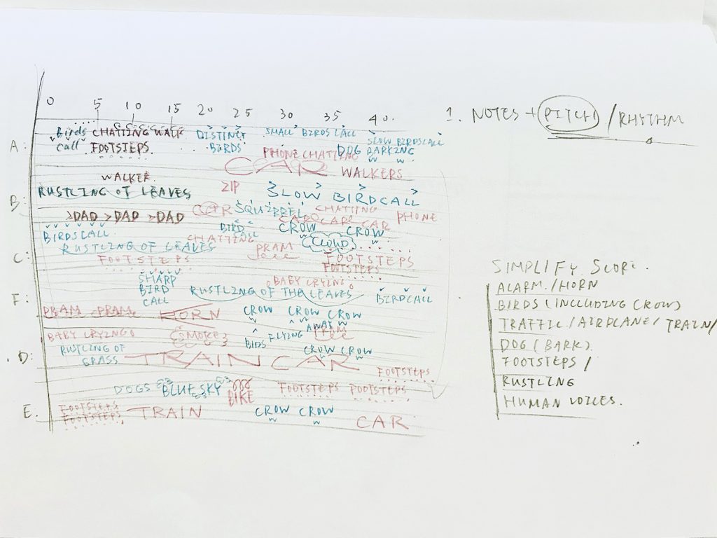
I placed the experiences from the six benches along the same time vector, abstracting the benches into the vertical axis. I no longer attempted to use graphic symbols but instead employed pure typography to narrate the events unfolding at this site. Rhythmic stave with simplified notations
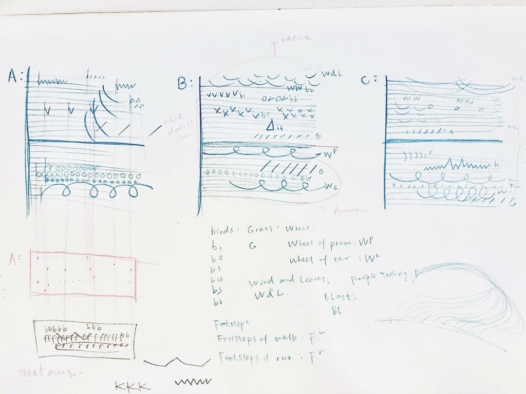
I placed the natural and unnatural sounds in the upper and lower sections of the stave respectively, as I found that natural sounds often have a higher pitch than unnatural ones. At the same time, I began to emphasize the use of position, space between symbols to express the rhythm of each sound type. Rhythm recorded with spacebar
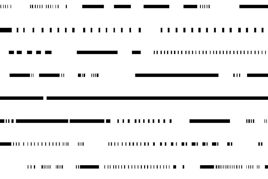
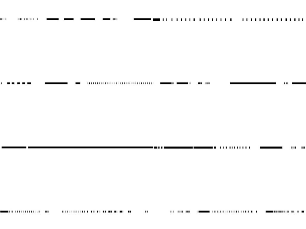
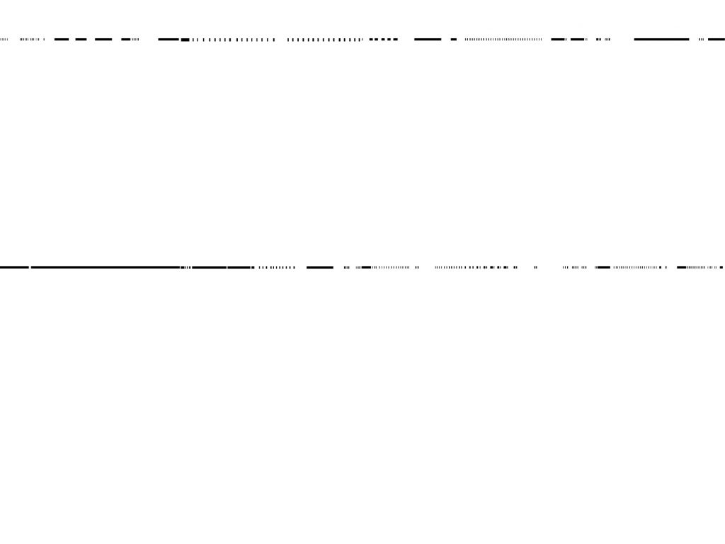
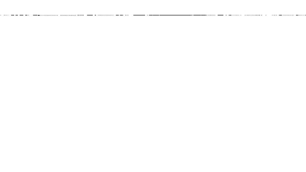
I wrote a simple programme that allows me to press the spacebar when I hear a sound, thereby generating a black bar. By employing a layout that compresses the black bars, I demonstrate how the greater the temporal scale, the more I disregard minute sounds, instead focusing on the rhythmic patterns of larger systems. Feedback
Based on the feedback, although I conducted numerous visual experiments, it appears I failed to clearly articulate during the presentation what new insights I gained through these visualisations. Week 3 3/10-10/10
I want to summarise and articulate the critical findings I have gained over these three weeks in a clearer visual format, the digital archive https://lgtopg.cargo.site(please view in chrome), thereby establishing a coherent knowledge framework.
Following three weeks of investigation, the critical findings I have gathered can be summarised in three points:
- The sound map from the first week recorded less the types of sounds and more the limits of my own perception, for I could only document one thing at a time. Yet as pedestrians passed me, leaves were also falling.
- The spatial rhythm of the bench placement coincidentally resonated with the site’s sonic cadence. The sound rhythm near the gate, predominantly derived from the street, felt more compact. This coincided with the benches near the gate being arranged in a tighter formation.
- Sound enabled me to perceive events unfolding behind me, revealing numerous surprises beyond my field of vision.
To better demonstrate how I uncovered these intriguing critical insights through the investigation process, I made hyperlinks for each investigation method mentioned on the summary.
At the same time, I devised some typographical effects to more vividly convey the literal meaning of the text.

The contents are arranged chronologically, documenting my investigative process.